Hyundai Card
Architect of change

Introduction
Hyundai Card is a South Korean financial services brand that goes far beyond traditional banking. Spanning premium credit cards, culture, fashion, music, architecture and digital experiences, the brand connects people to their interests and aspirations. We developed a distinctive visual identity that brings these worlds together, creating a flexible, recognisable brand system that reflects Hyundai Card's ambition to make finance a gateway to new experiences.

Overview
At Wolff Olins, I was part of the team that developed the brand strategy, visual identity and creative expression for Hyundai Card. Building on its distinctive vertical card format, we created a graphic language that connects the brand's diverse businesses, products and experiences. From premium card design and packaging to campaigns, digital experiences and brand architecture, we established a cohesive visual system that brings together finance, culture and lifestyle, positioning Hyundai Card as a brand that connects customers to their aspirations.
Architect of Change
Originally conceived as a design ethos, Architect of Change evolved into Hyundai Card's defining brand tagline. Rooted in the power of design to drive change, it captures the brand's ambition to challenge conventions, shape culture and create new possibilities.
A card that connects worlds
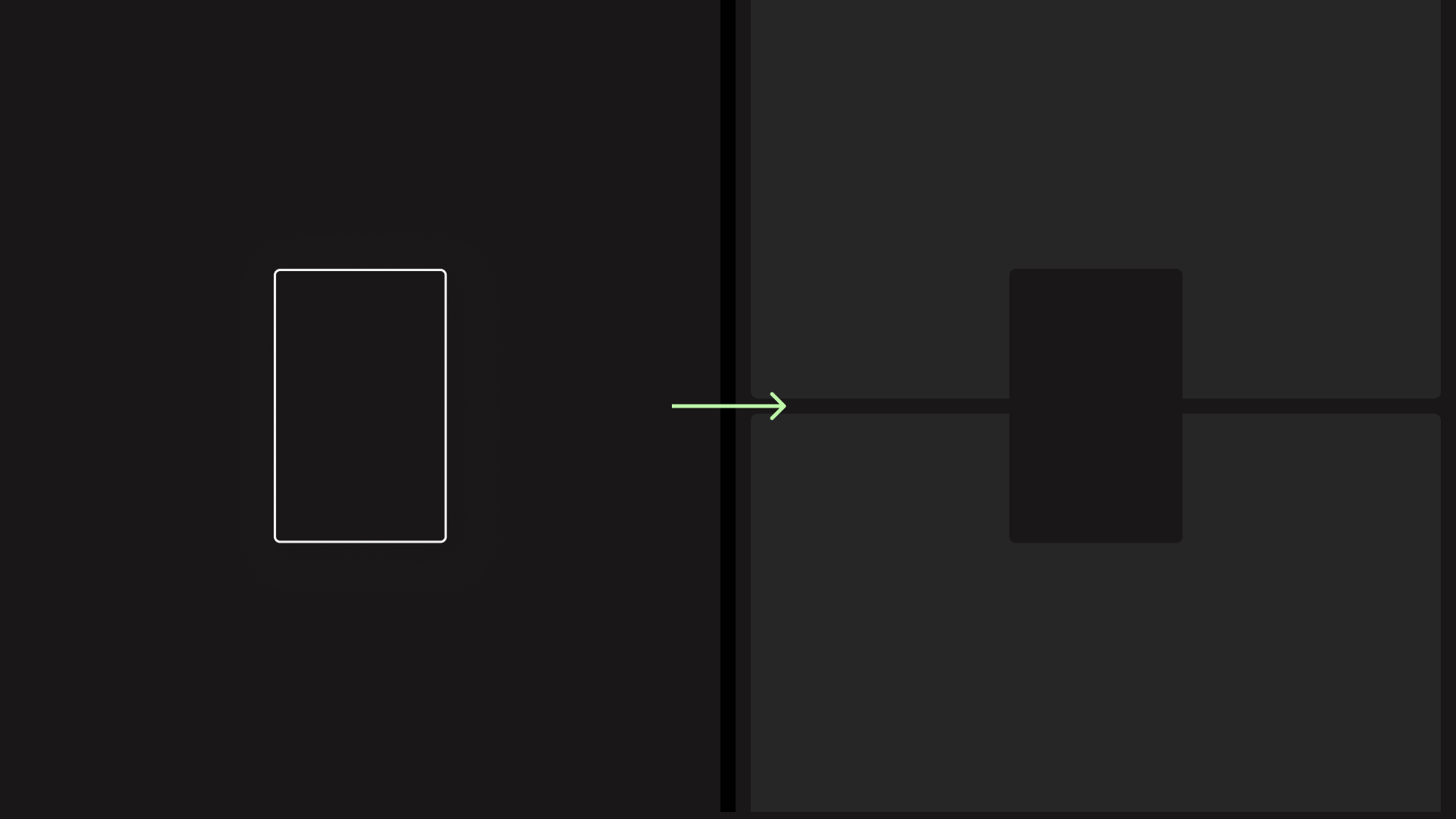
Hyundai Card's distinctive vertical format became the defining graphic device of its visual identity. Acting as a bridge between people, products and experiences, the shape connects customers to their interests and aspirations through a flexible, recognisable brand language.

A reflection of who you are
The Hyundai Card visual identity connects customers with the things that inspire them. From fashion and culture to lifestyle and design, the graphic device reflects personal identity, individual interests and future aspirations.
Connecting the bigger picture
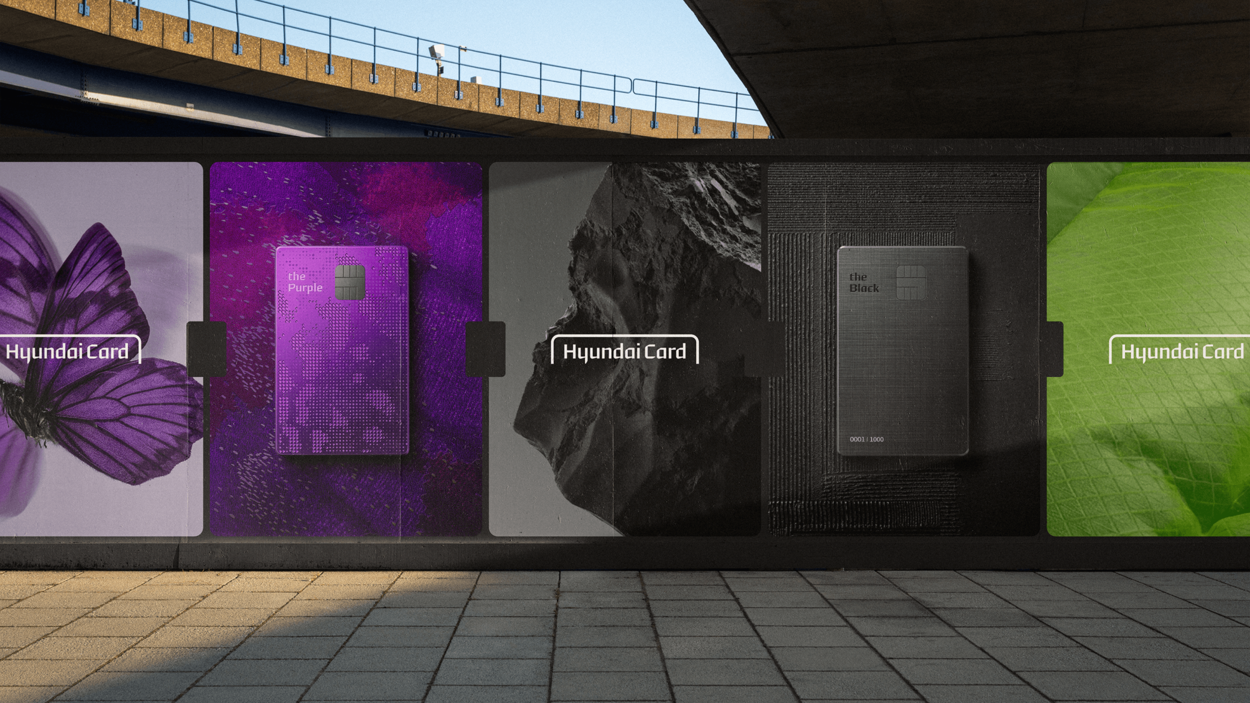
Across out-of-home advertising and brand campaigns, the vertical card device connects products, people and culture. The flexible graphic system brings together card designs and inspirational imagery, creating a cohesive and recognisable visual language.

The Purple: A world of wonder
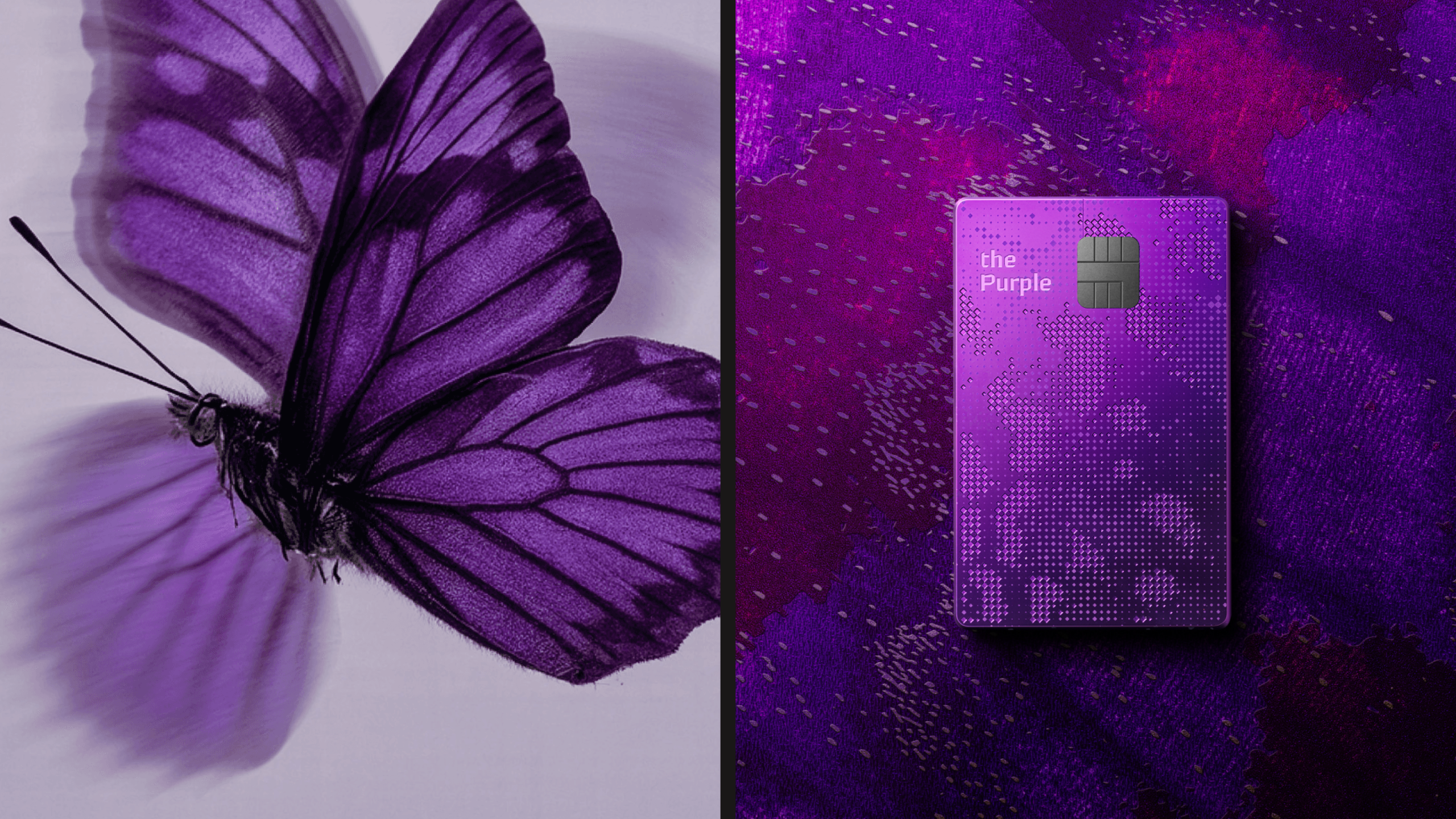
One of Hyundai Card's most exclusive credit cards, The Purple celebrates luxury, fashion and cultural discovery. Rich purple tones, expressive photography and considered art direction create a sophisticated visual world inspired by extraordinary experiences.
Inspired by the extraordinary
inspired by the relationship between luxury, exploration and collecting rare objects, The Purple draws on the intricate beauty of butterfly wings. Their delicate patterns and textures informed a distinctive card design that captures wonder, discovery and sophistication.
Luxury in every detail
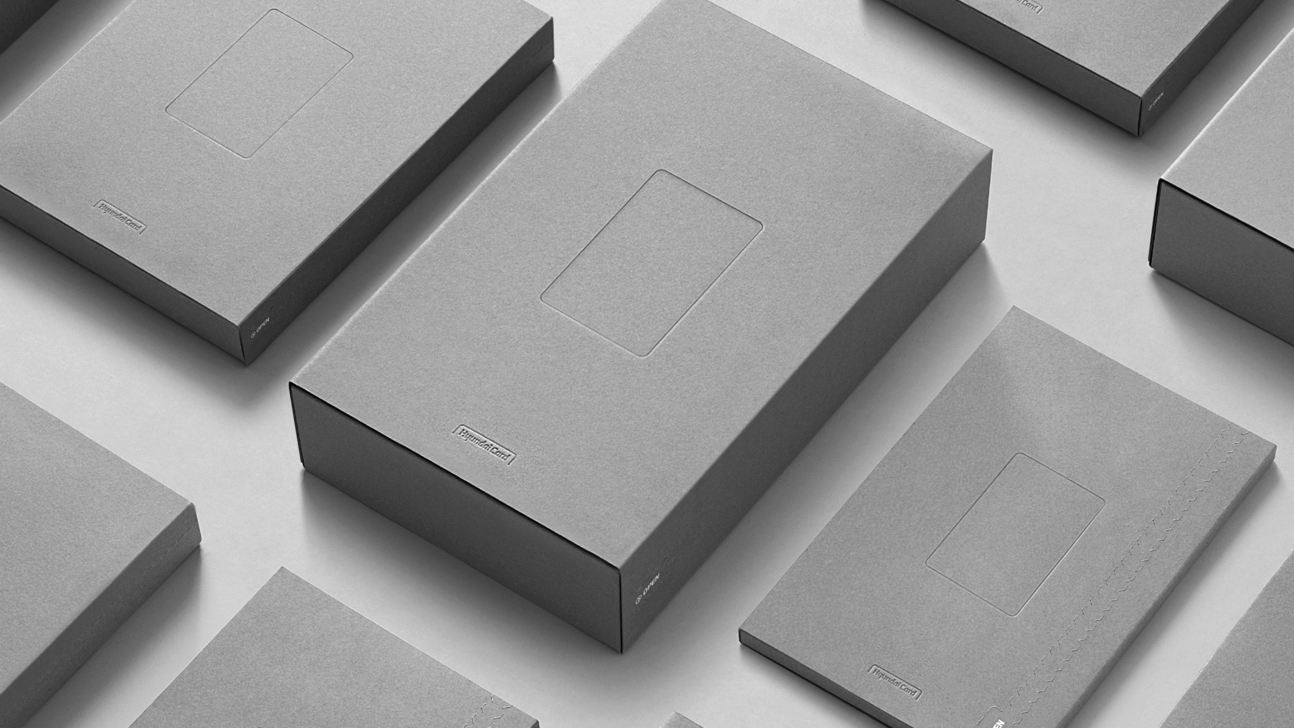
A premium packaging system designed across Hyundai Card's different product tiers. Minimal grey materials, subtle blind embossing and refined details create an understated sense of luxury, building anticipation for the experience inside.
Designed to be discovered
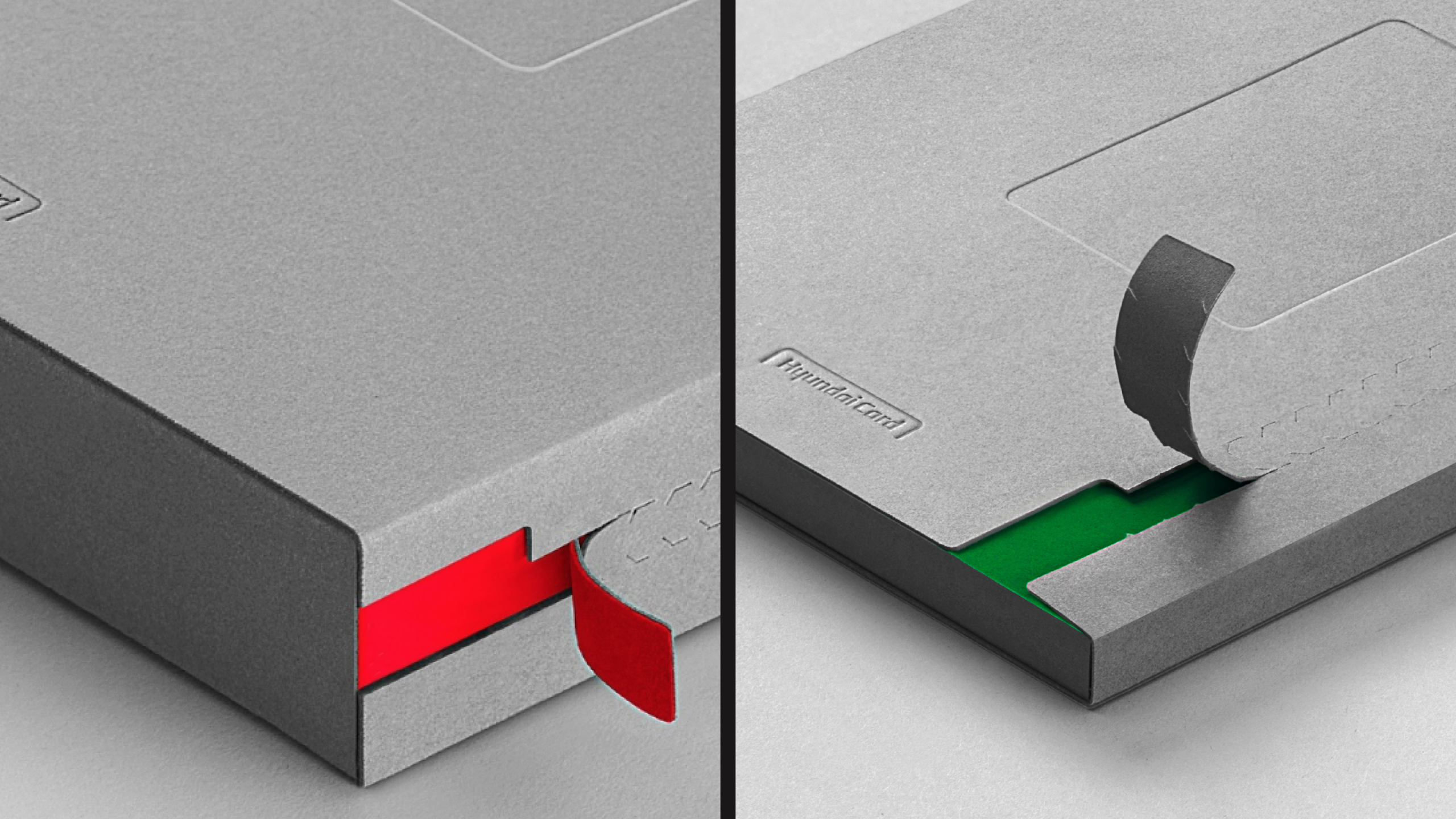
A considered unboxing experience that transforms opening a credit card into a moment of discovery. Perforated openings, guided by the Hyundai Card logo silhouette, reveal unexpected flashes of colour, contrasting with the minimal exterior.
Making data distinctive
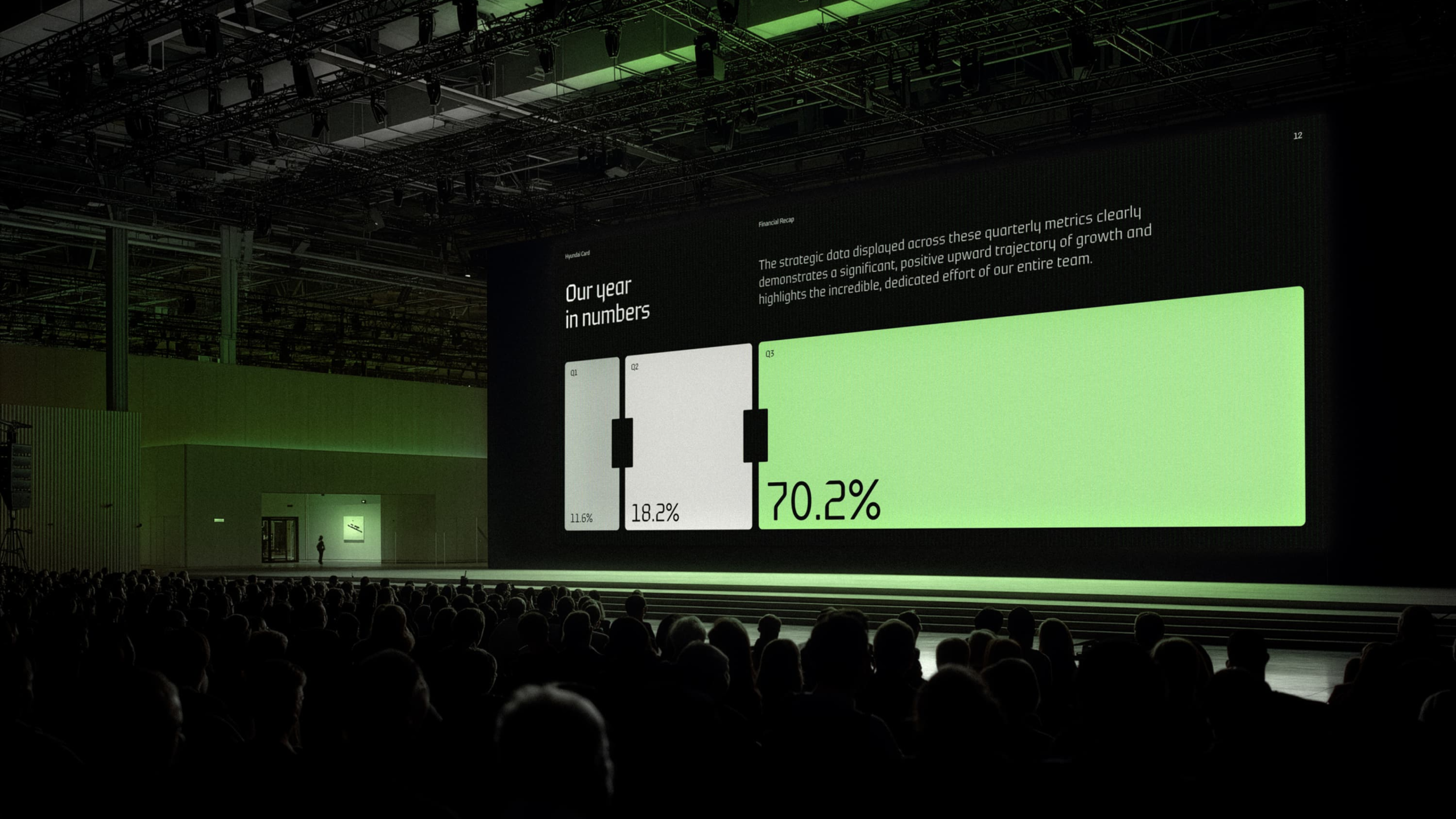
Hyundai Card's graphic identity extends into data visualisation and corporate communications. Using the vertical card device as a flexible framework, the system transforms complex information into clear, distinctive and recognisable brand expressions.
One connected identity
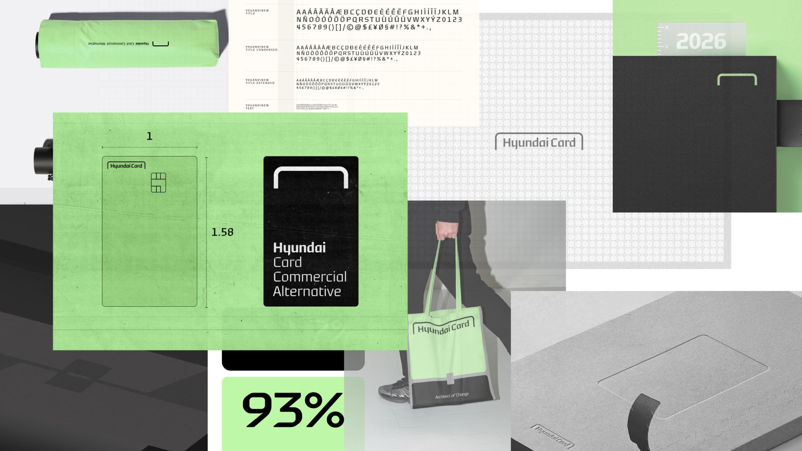
A unified brand architecture connecting Hyundai Card, Hyundai Commercial and Hyundai Alternative. The distinctive logo lockup establishes a consistent visual relationship between the three businesses, balancing individual recognition with a shared brand identity.

On stage in Seoul
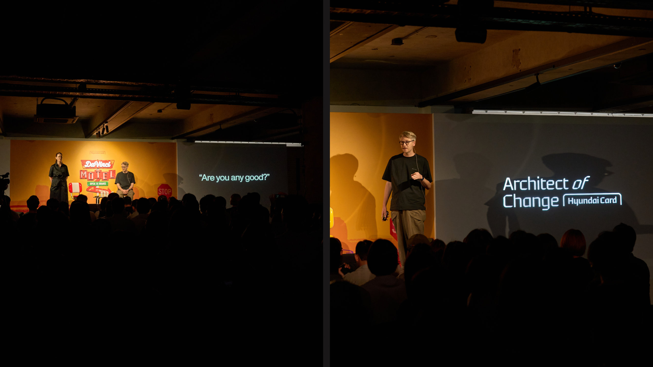
In 2025, Emma Barrett and I were invited by Hyundai Card to speak at Da Vinci Motel, an exclusive cultural festival in Seoul, South Korea. Bringing together leading voices from design, art and culture, the event provided a platform to share our perspectives on branding, creativity and the power of design.
Designing for impact
Our live talk, Designing for Impact: Why Perceptions Matter, explored how branding and design influence the way people think, feel and behave. Through creative insights and real-world examples, we shared how powerful ideas and distinctive brand identities can challenge perceptions, build meaningful connections and drive lasting change.
Role
Creative Director
Responsibilities
→ Brand Identity & Visual System
→ Creative Direction
→ Product & Packaging Design
→ Digital & Brand Experiences
Credits
Wolff Olins
Featured work
A selection of recent projects.

JAJA Tequila
Made for Magic Hour

Tomorrow
Sleep Better
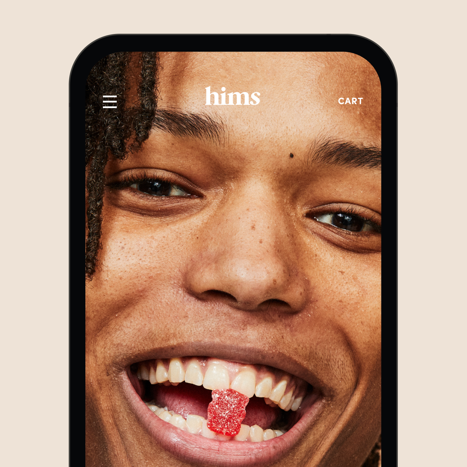
Hims
Telehealth for a healthier you
Let's Chat.
Opportunities start with a hello. Whether you’ve got a brief, a thought, or a good story, I’d love to hear it.
© 2026 Matthew Haysom.