Uber
Travel Smarter
Introduction
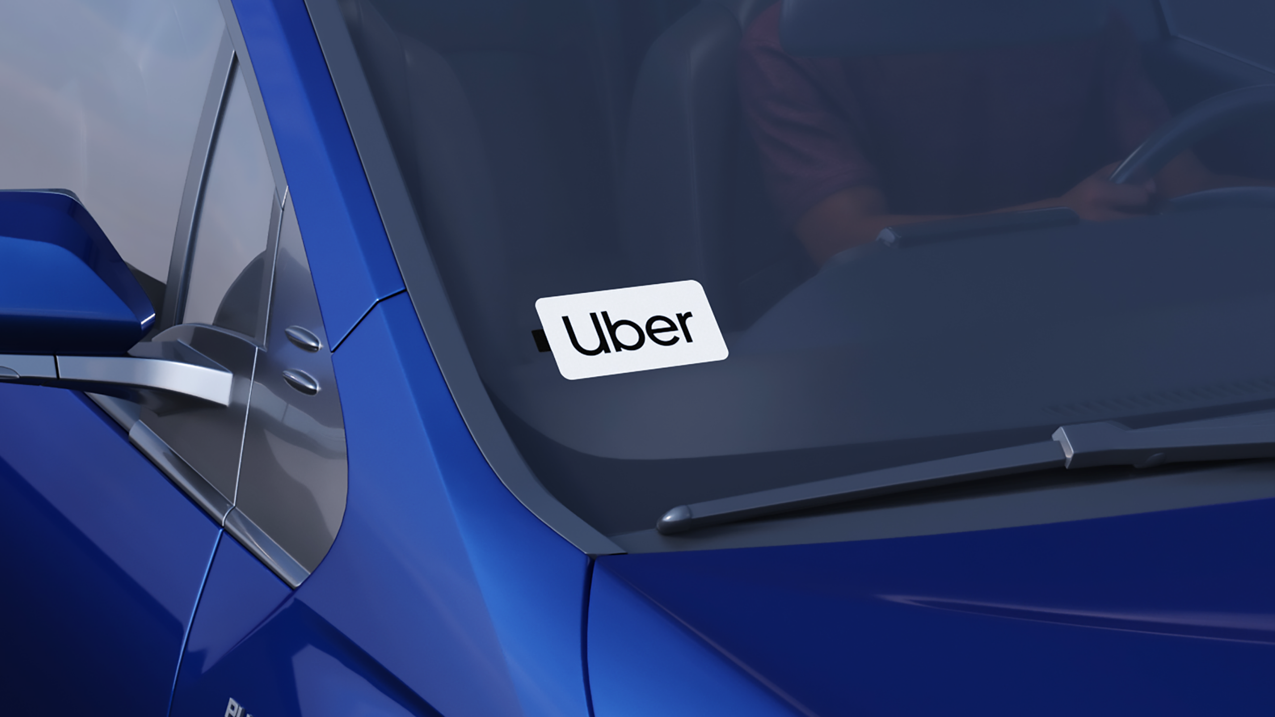
Uber Travel was a new multimodal travel experience designed to help people move more intelligently from door to destination. Building on Uber’s existing brand, it brought rides, trains, coaches, flights, car hire and more into one connected journey, making travel feel simpler, smarter and more in control.

Overview
At Wolff Olins, I was part of the team that developed the positioning, proposition and visual expression for Uber Travel’s UK launch. We created Travel Smarter: a new promise centred on keeping travellers a step ahead at every stage of their journey. From the in-app experience to campaigns, social and out-of-home, we developed a flexible system that made a growing range of travel modes easy to understand, choose and connect.

Built for movement
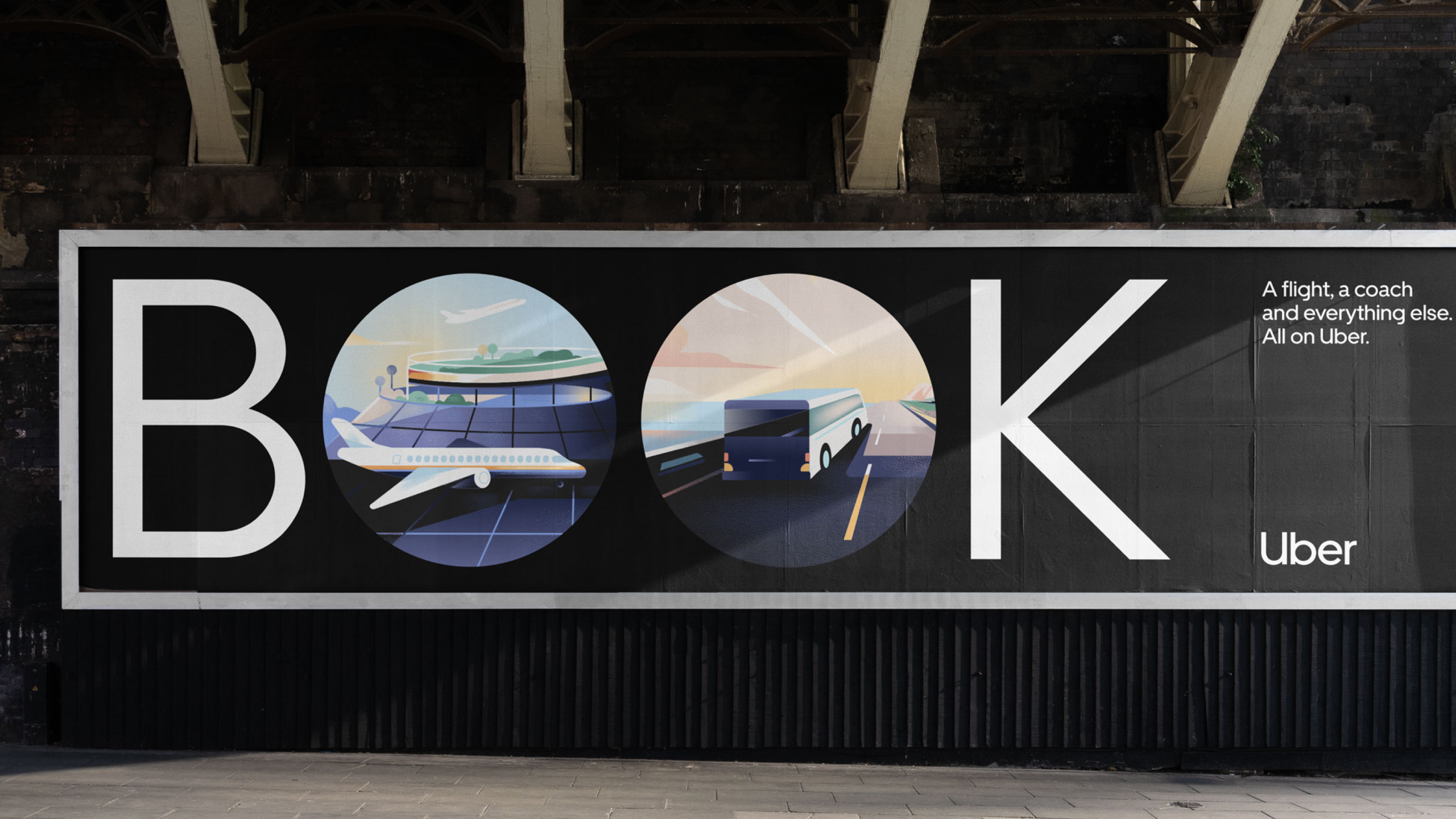
A simple circle, line and square gave Uber Travel a clear, ownable visual language.
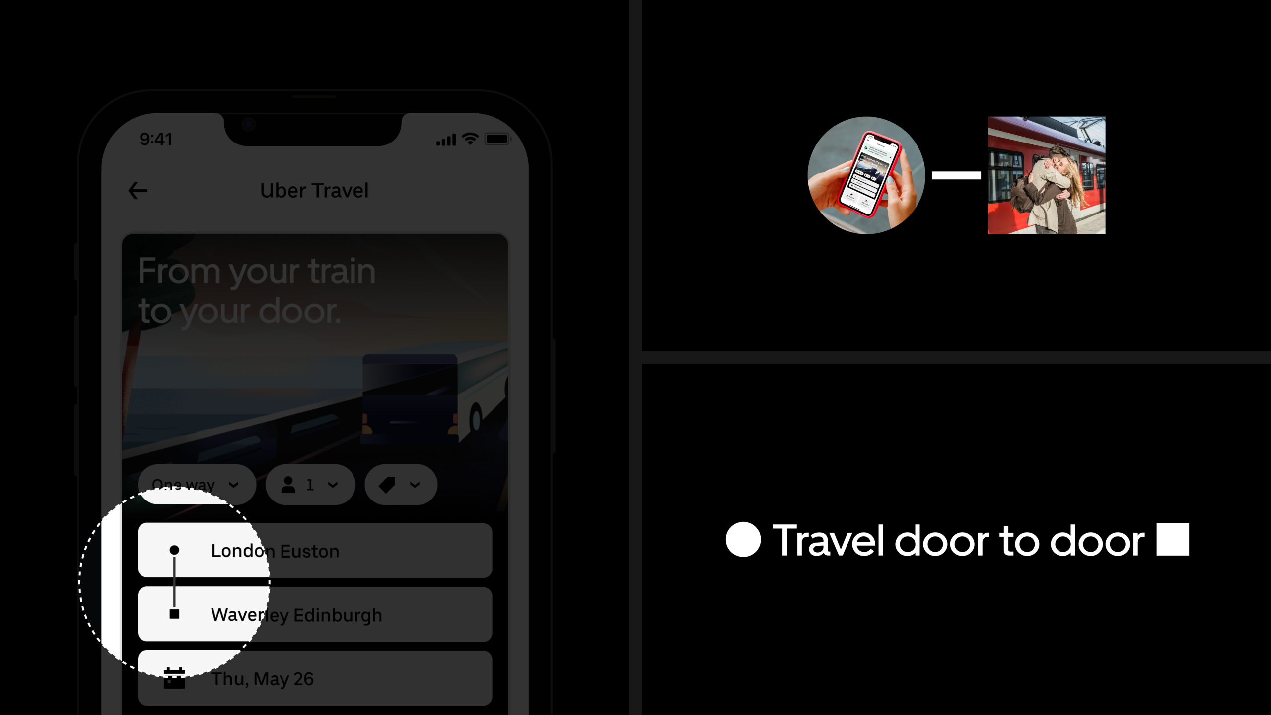
From app to campaign
The same device connected product, marketing and every touchpoint in between.
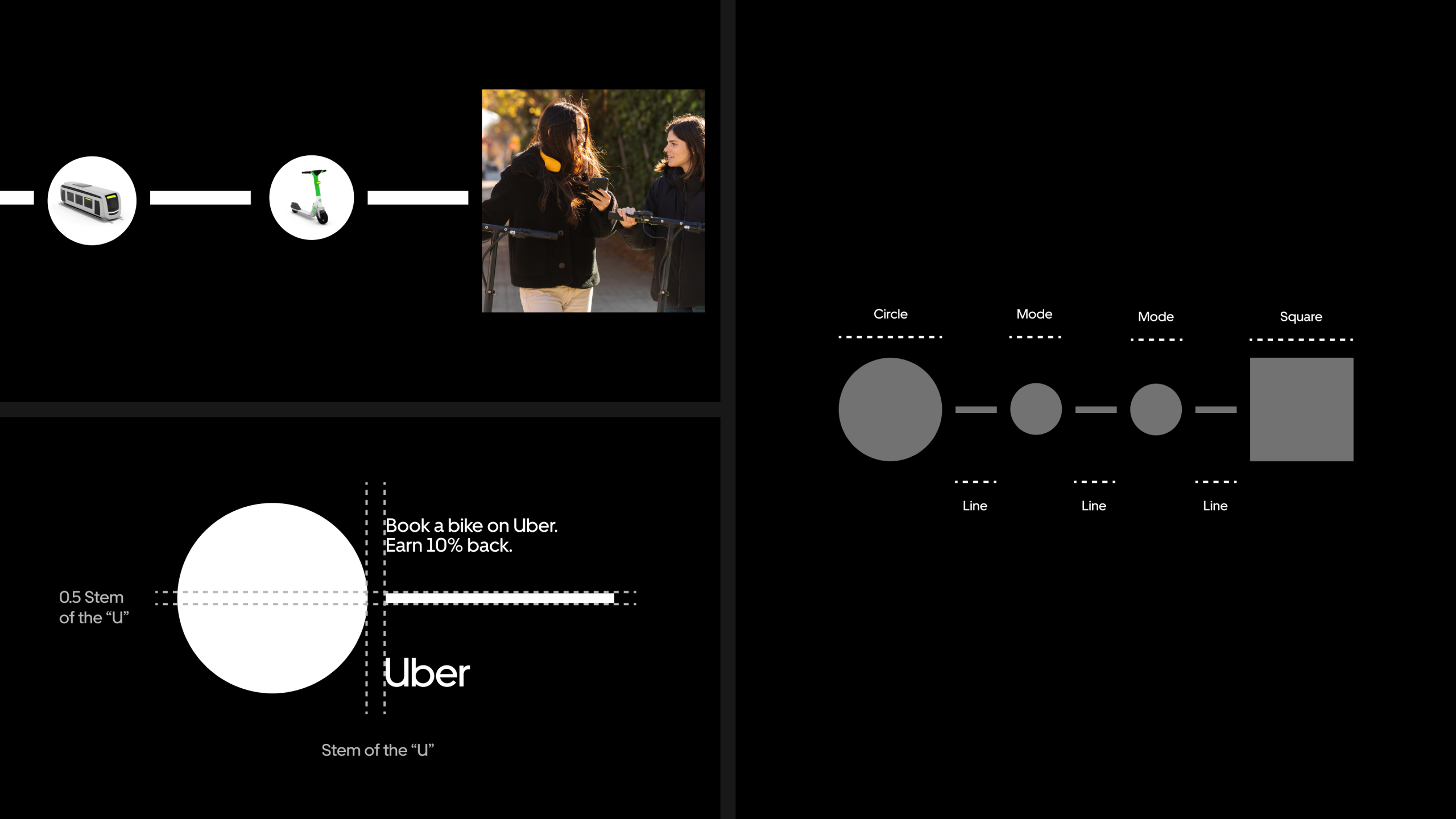
A system with meaning
The visual device was built around a clear logic: circles for modes, lines for journeys and squares for destinations.
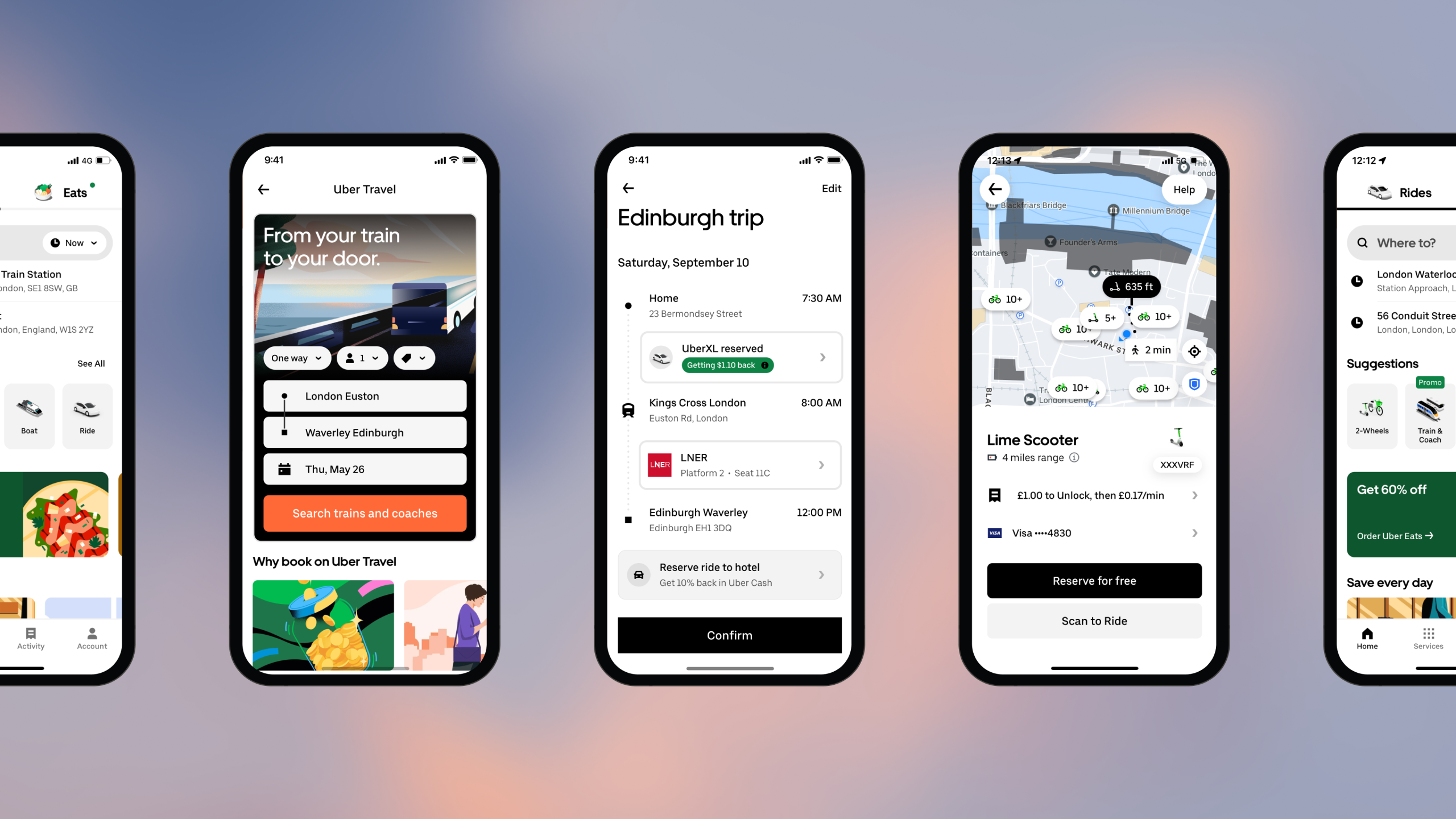
One trip, clearly mapped
A connected itinerary made it easier to see the journey as a whole — not as a series of separate bookings.

From search to seat
The product experience brought journeys, schedules and travel modes together in one place.
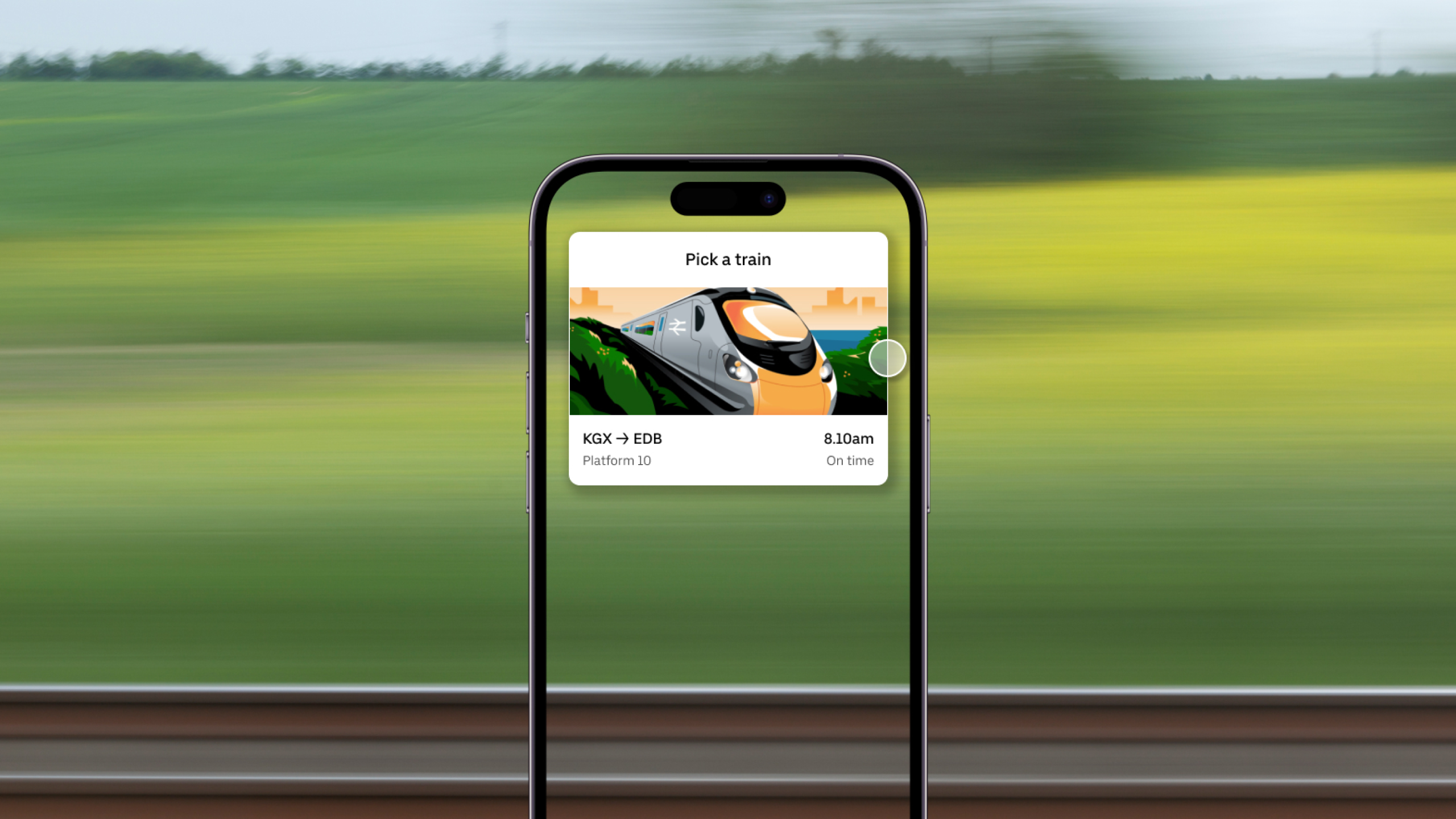
Choose your train
llustration added clarity and character to the booking experience, helping people make decisions with confidence.
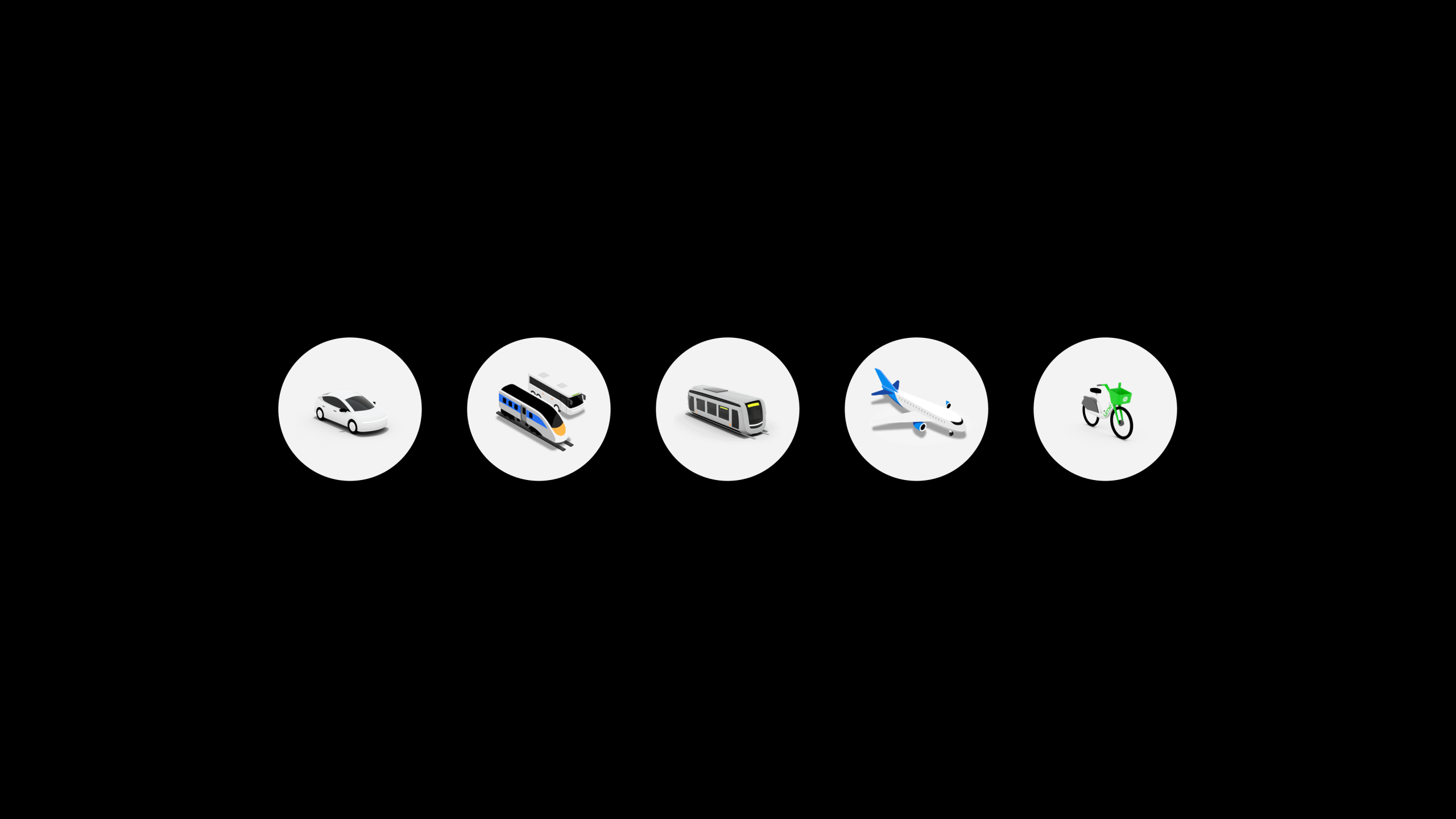
A growing fleet
A suite of illustrated modes gave every way to travel a clear and recognisable presence.
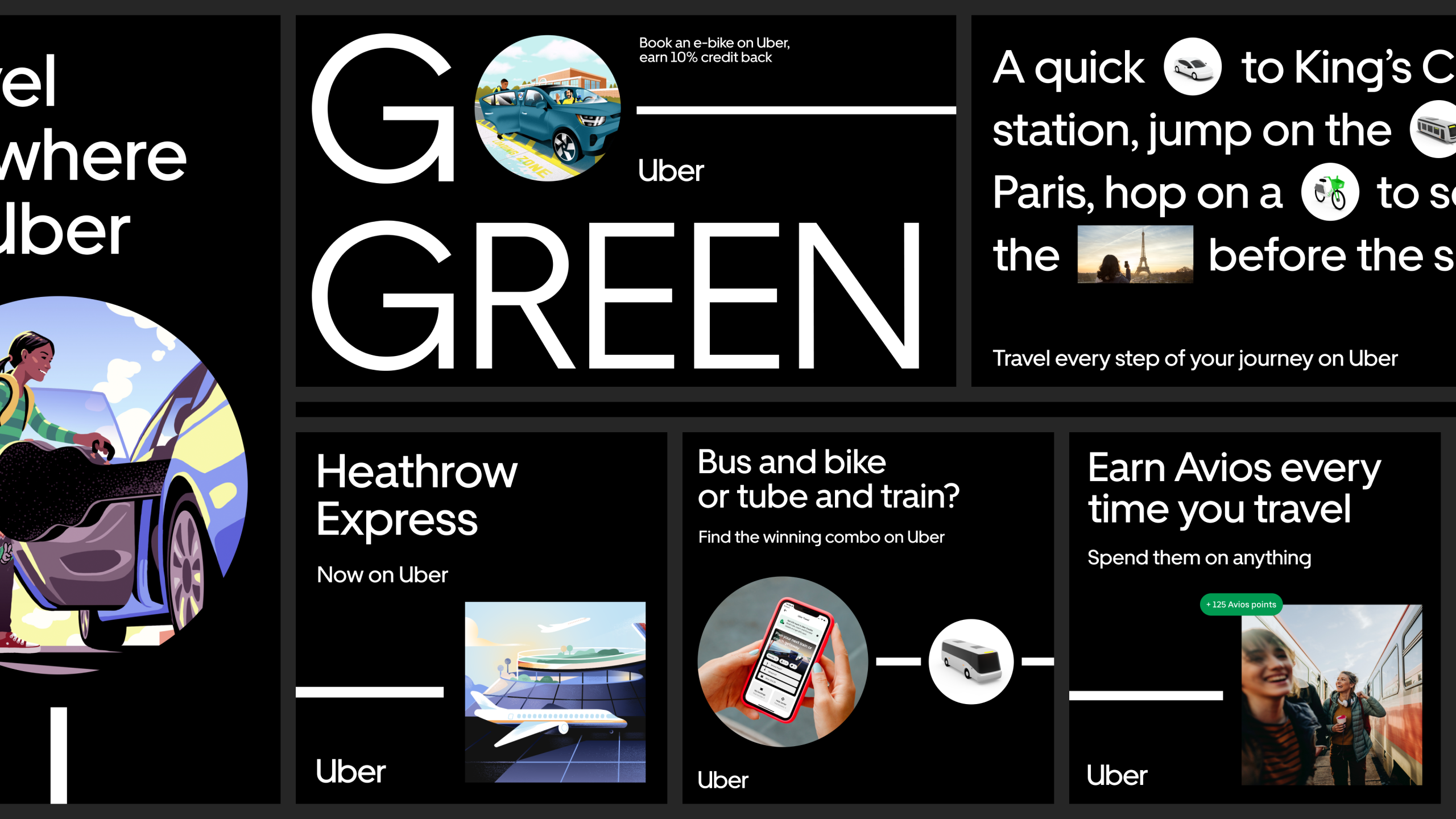
One system. Many stories.
The visual language flexed across campaigns, from greener journeys to airport transfers and everyday connections.
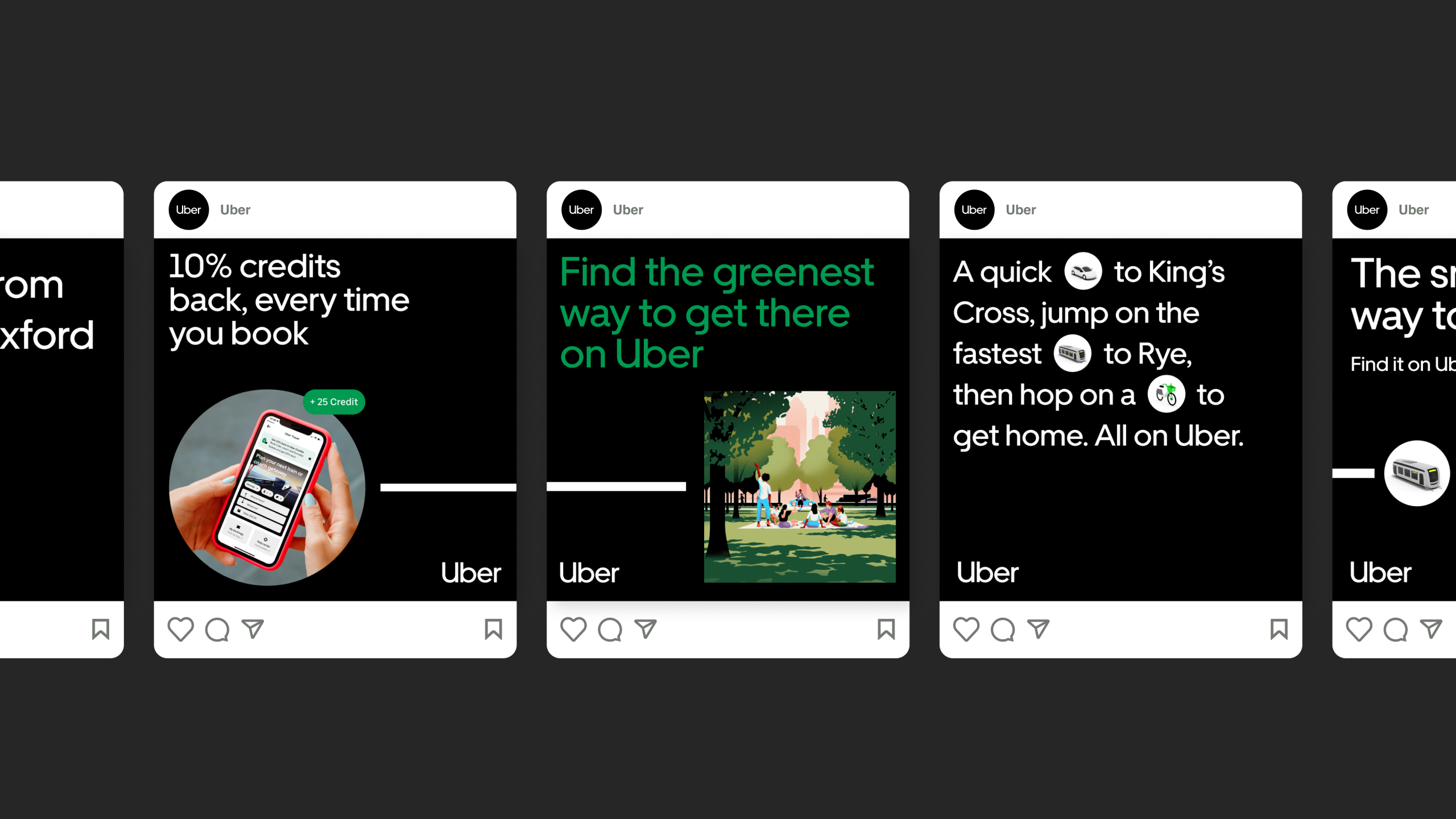
Made for the feed
A flexible social toolkit turned travel planning, rewards and smarter choices into scroll-stopping stories.
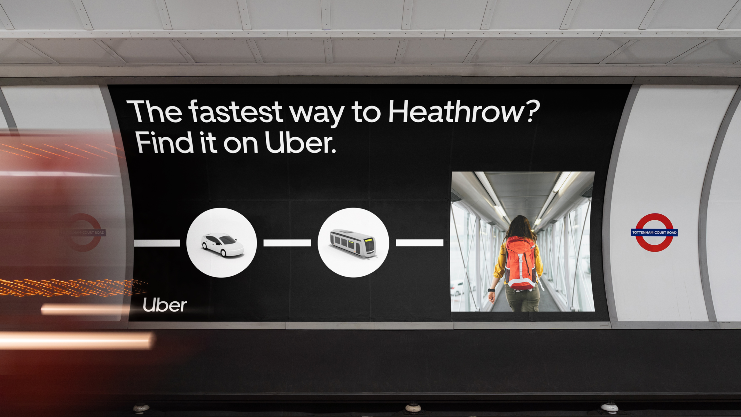
Making the connection
Out-of-home made multi-modal travel visible in the moments people needed it most, showing the fastest route to Heathrow, from ride to rail to departure gate.
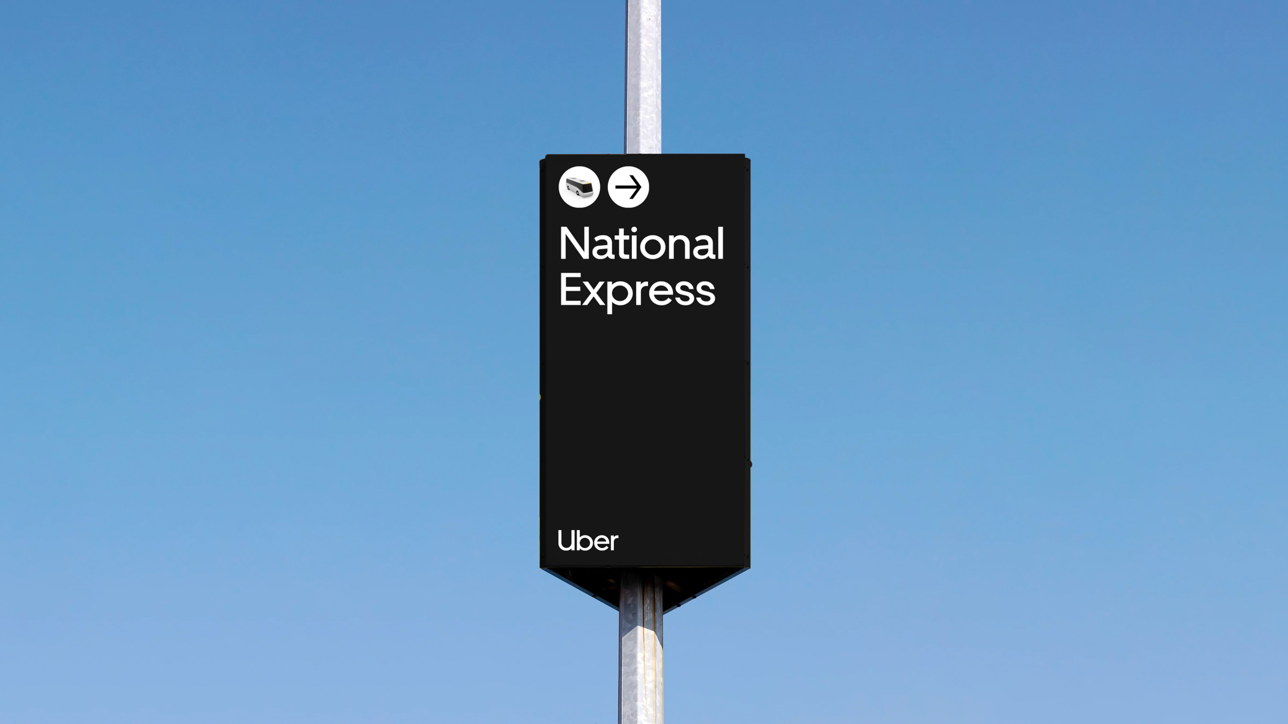
A clearer way forward
The circle-and-line device translated into simple, directional signage, making each travel mode and the journey between them easy to understand at a glance.
Travel in hand
The system extended into tangible travel moments, from in-app mode selection to luggage tags, bringing the Uber Travel experience beyond the screen.
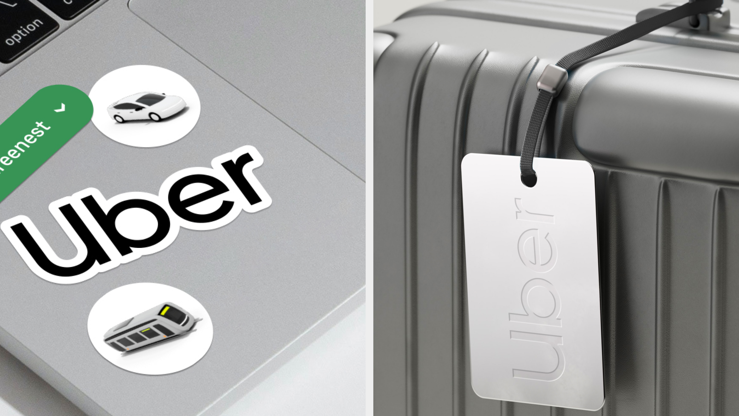
Travel, made tangible
The Uber Travel system extended beyond the app into physical moments, bringing a connected way of moving to the things travellers carry with them.
Role
Associate Creative Director
Responsibilities
→ Visual Expression
→ Product & Interactive Design
→ Illustration Art Direction
→ Campaign
Credits
Wolff Olins
Featured work
A selection of recent projects.

JAJA Tequila
Made for Magic Hour
Tomorrow
Sleep Better
Hims
Telehealth for a healthier you
Let's Chat.
Opportunities start with a hello. Whether you’ve got a brief, a thought, or a good story, I’d love to hear it.
© 2026 Matthew Haysom.