Google
Workspace
Introduction
Google Workspace is a cloud-based productivity suite used by more than three billion people worldwide. In 2020, Google rebranded G Suite as Google Workspace, unifying Gmail, Drive, Meet, Docs, Sheets, Calendar and more under a single, coherent product identity.
Three billion people.
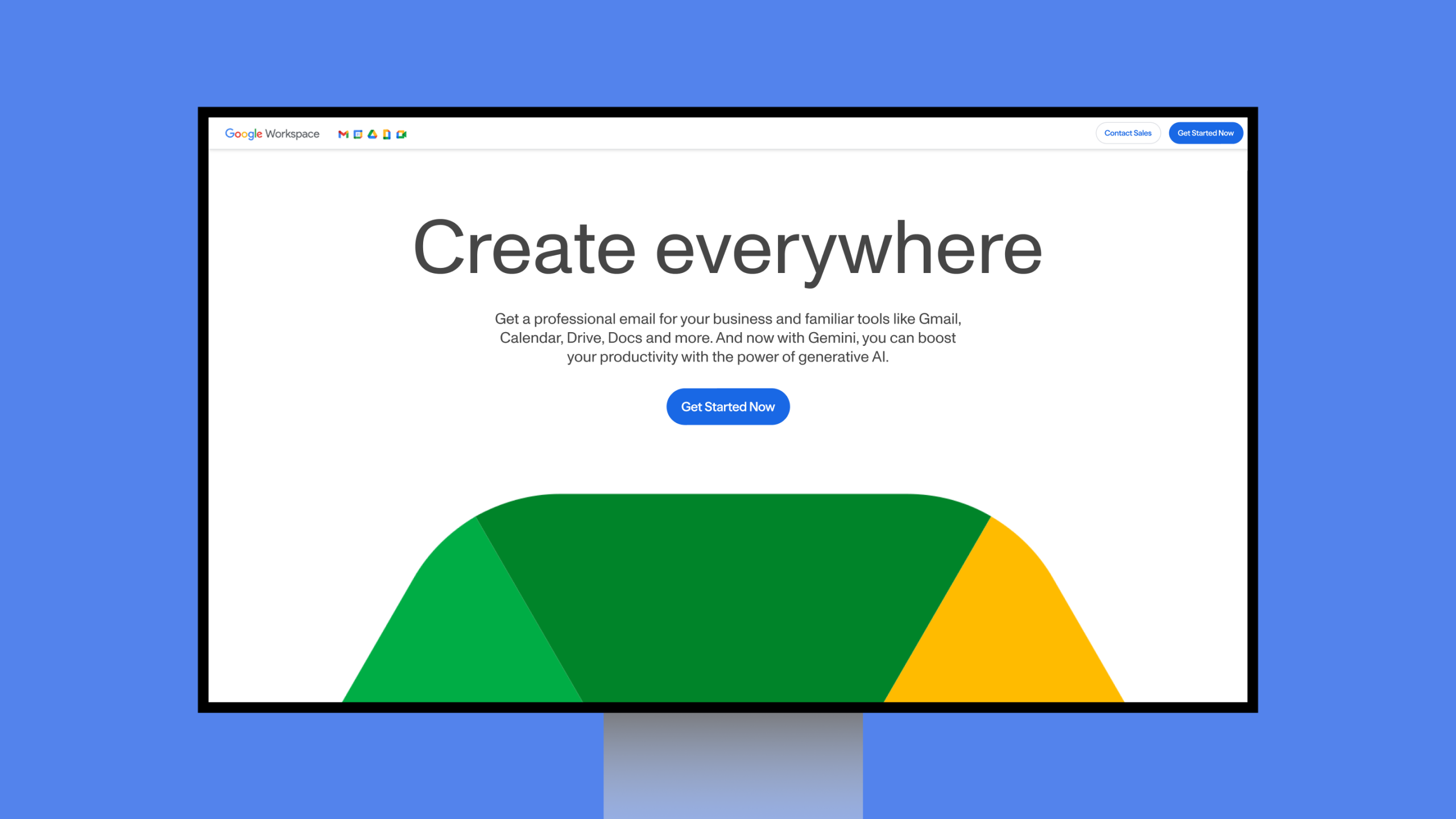
The Google Workspace homepage, a unified product identity built from four colours and a single geometric language.
Overview
At Wolff Olins, I was part of the design team that helped shape the new Google Workspace identity, creating a visual system that gives each product its own character while feeling unmistakably like one family. Built around Google's four signature colours and a shared geometric language, the system scales across product icons, digital surfaces, and global brand communications.
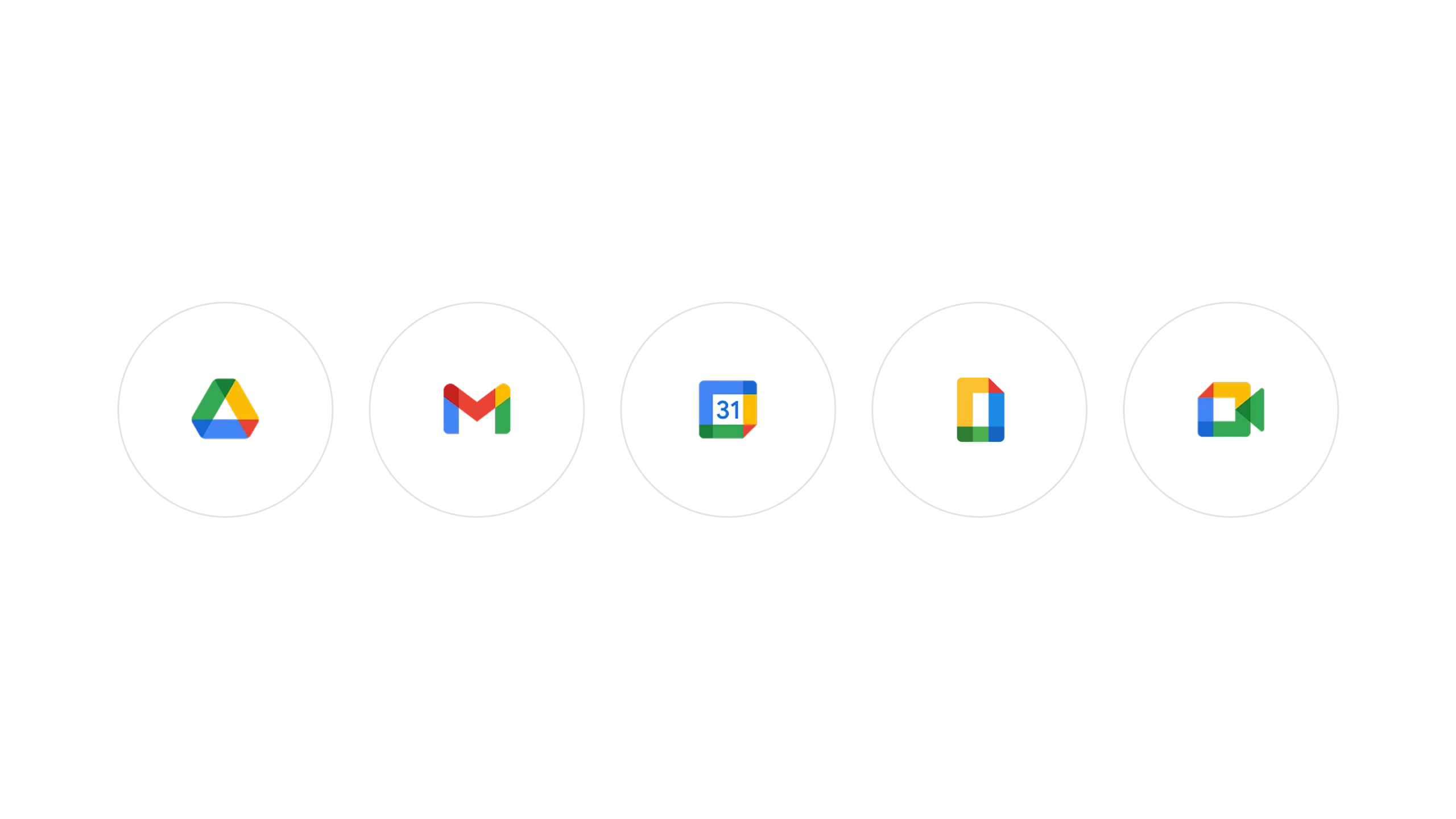
Five products. Four colours. One family.
Google Workspace product icon design, a unified visual identity system built on a common geometric framework and Google's four signature colours.
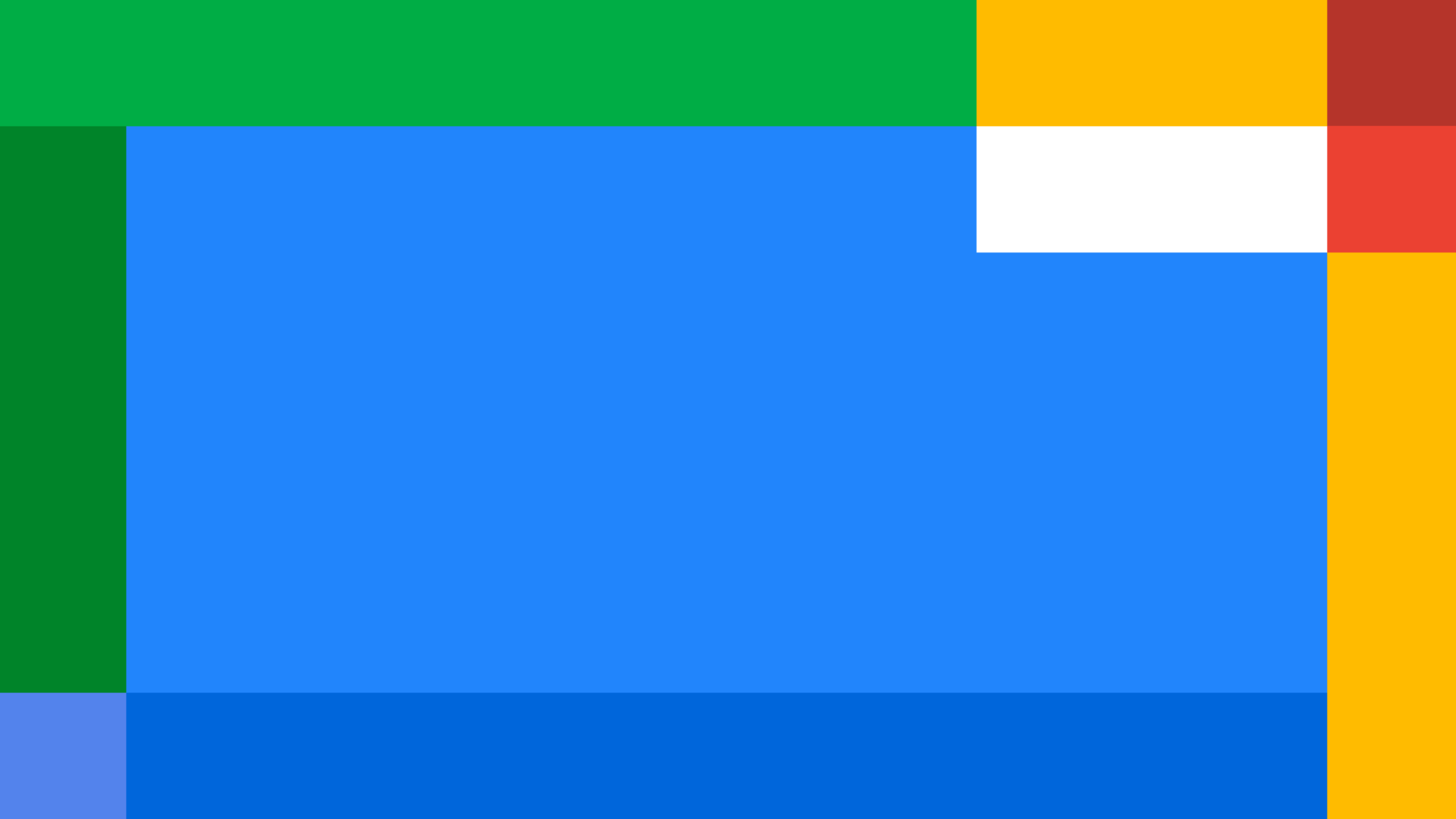
Colour as architecture
The Google Workspace brand colour system — a modular grid of Google's four signature colours, designed to flex across every product surface and communication.
Geometry in motion
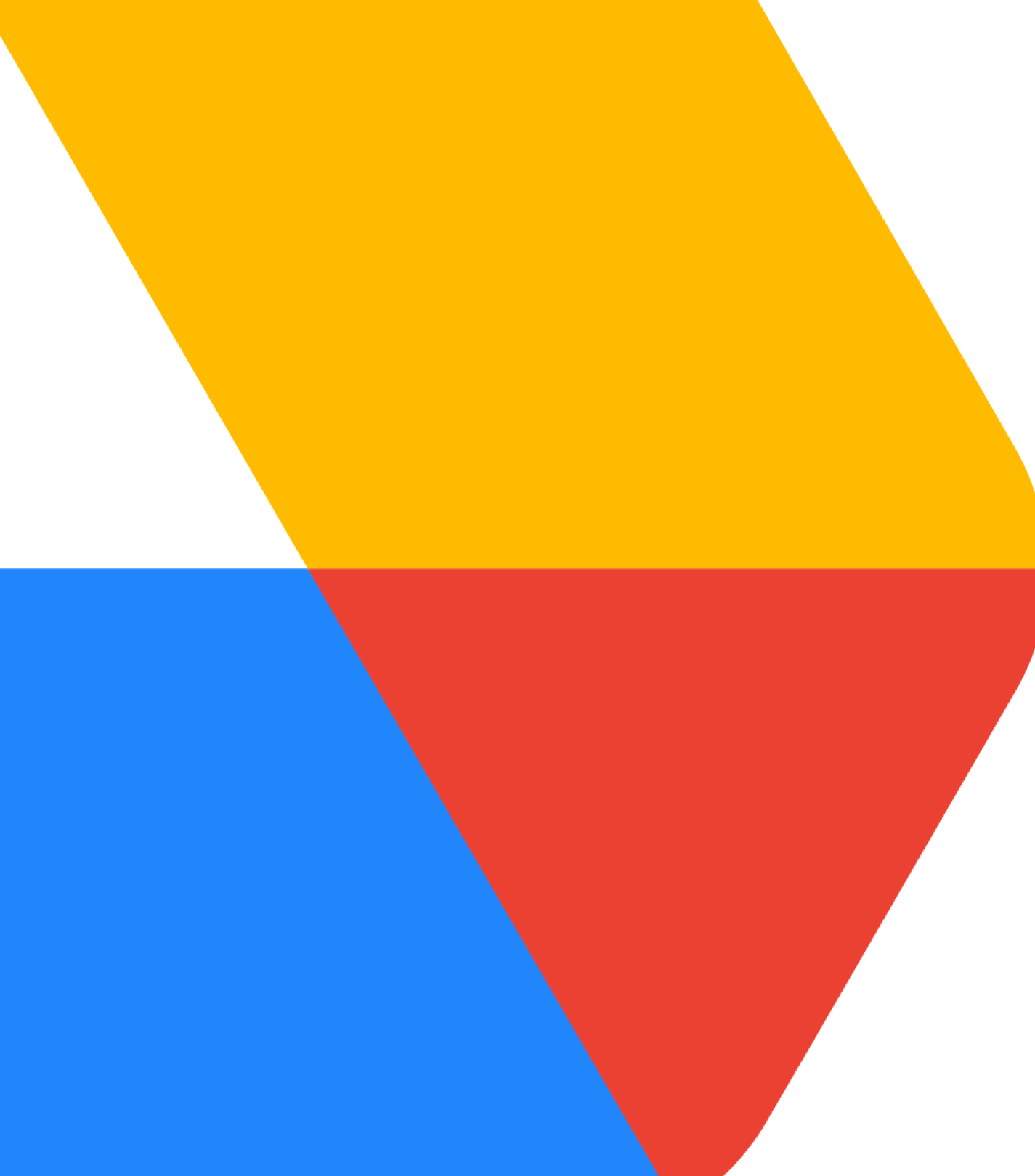
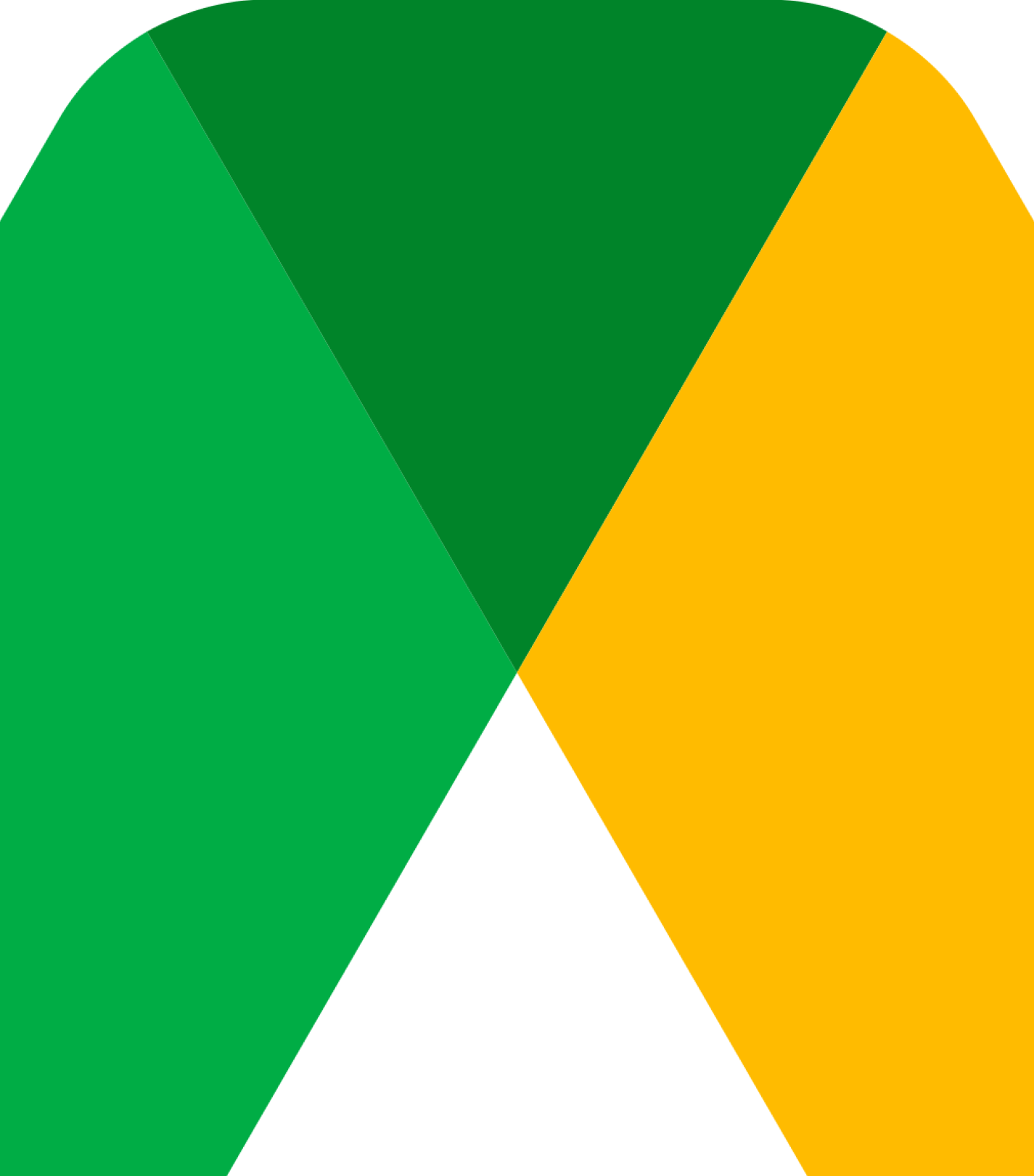
Google Drive icon detail, the geometric system at close range, showing how three signature colours lock together into a single, unmistakable product identity.
Geometry in motion
The Drive icon deconstructed, three colours, three planes, one shape that feels both engineered and alive. Google Workspace product icon design.
A system that scales
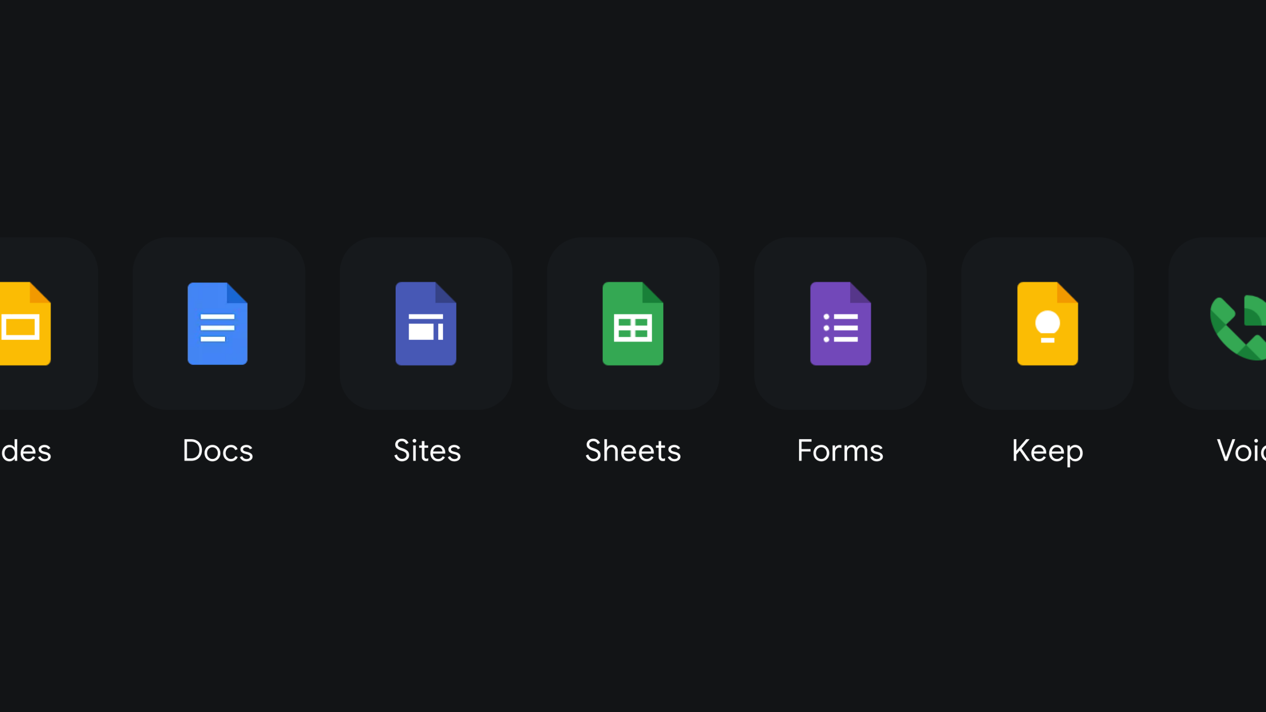
Google Workspace icon design, product icons for Docs, Sheets, Slides, Forms, Sites and Keep, built on a common visual framework that holds together at every size and on every surface.
The icon, at home in the interface
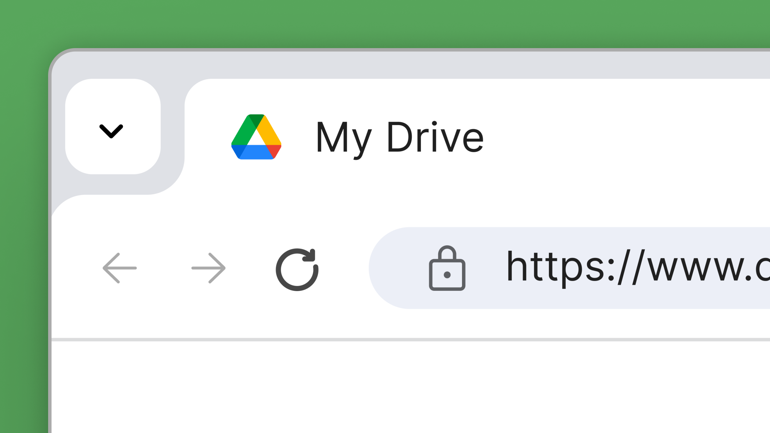
Google Drive UI detail, the Workspace icon system applied in-product, where the visual identity becomes part of the everyday digital experience.
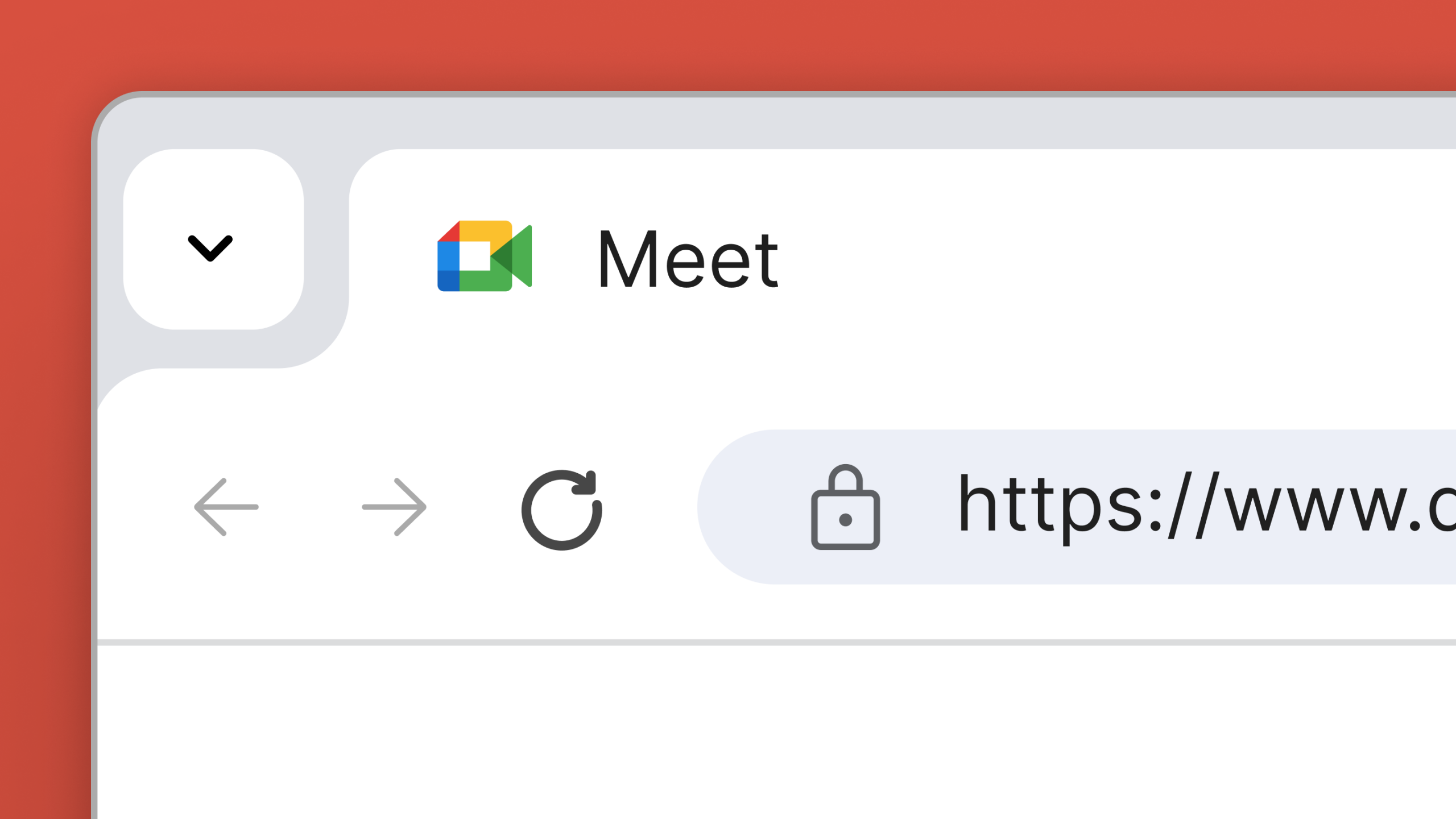
Same system. Different product.
Google Meet UI detail, the icon identity applied in-product, showing how the Workspace visual language holds its character across every surface and every screen.
Role
Senior Designer
Responsibilities
→ Visual Identity
→ Art Direction
→ Creative Consultation
Credits
Wolff Olins
Featured work
A selection of recent projects.
Let's Chat.
Opportunities start with a hello. Whether you’ve got a brief, a thought, or a good story, I’d love to hear it.
© 2026 Matthew Haysom.