Biscuit
Reward good taste

Introduction
Biscuit is Zopa Bank’s free current account, designed to give customers more from their everyday money through interest, cashback and benefits they can switch as their priorities change. It challenges the traditional current-account model by moving the conversation beyond rates and towards the everyday value a better bank account can unlock.
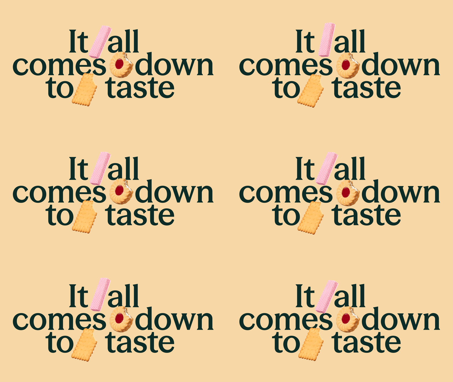
Overview
Zopa Bank’s in-house design team partnered with DEPT to refresh Biscuit’s brand identity and platform. Together, we evolved the world around three customer-led ideas: Choice, Change and Maximise, creating a flexible visual system that shows how the account adapts to real life, across every touchpoint. Working with food photographer Frankie Turner, we also created a bespoke shoot that gave each biscuit character its own form, texture and personality, building a richer, more flexible brand world for Zopa Bank’s current account.

From one Biscuit to four
Biscuit 2.0 evolved the original Jammy Dodger into a family of four distinct biscuit profiles: Jammy, Wafer, Chocolate and Butter. Together, they create a richer, more flexible brand world for Zopa Bank’s current account.
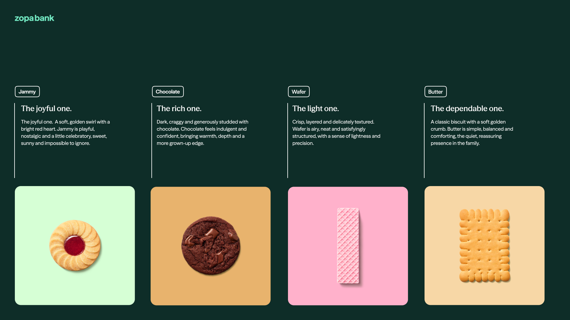
A flavour-led brand world
The refreshed Biscuit brand identity uses a family of biscuit forms to give Zopa Bank’s current account a warmer, more distinctive personality. Each form carries its own role, creating a flexible visual language for everyday banking benefits.

A richer Biscuit world
The shoot captured a full spectrum of imagery: from individual characters captured at multiple angles to more expressive, art-directed still lifes featuring stacks, plates and mugs.
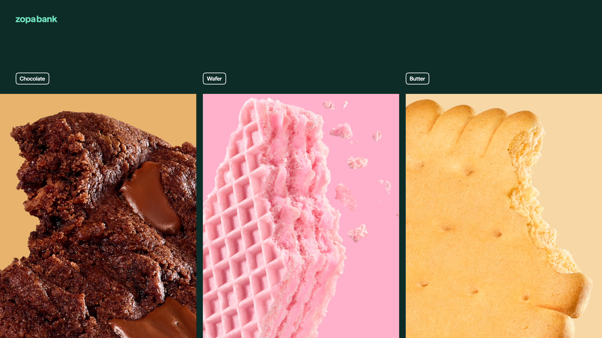
Built from texture and taste
Macro biscuit photography brings richness, tactility and appetite appeal to the Biscuit current account campaign. From chocolate to wafer and butter, the expanded world gives the brand depth without losing its clarity.
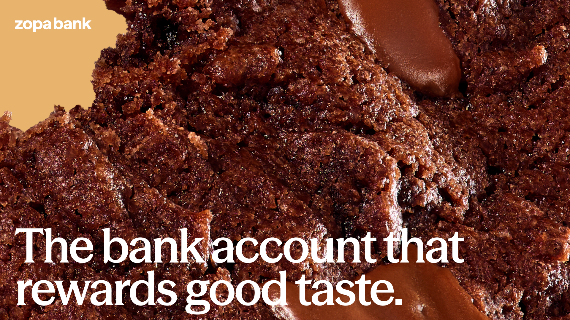
A current account with more to offer
Biscuit puts everyday value front and centre, giving customers the freedom to choose the benefits that matter to them, and change them as life does.

A name with more character
The Biscuit wordmark was refined to feel confident, friendly and unmistakably its own. Set against dark green, it creates a strong, recognisable signature for Zopa Bank’s benefit-led current account.
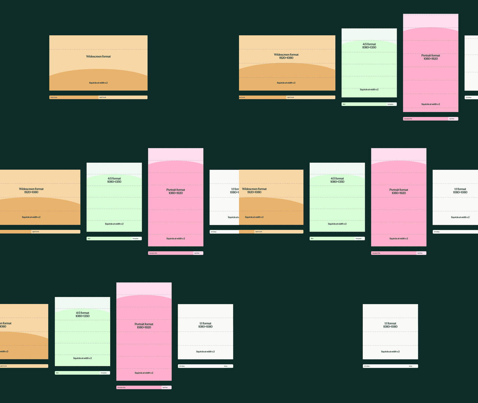
Designed to flex across formats
A responsive layout system adapts the Biscuit brand identity across digital and campaign formats. Colour, scale and the rounded squircle device create consistency from widescreen web experiences to mobile-first social content.
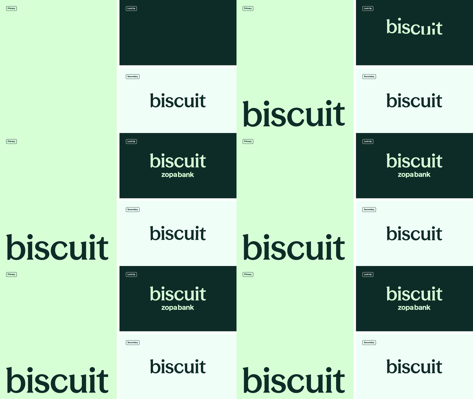
A logo built to move
The Biscuit logo was designed as a flexible identity system, with three distinct motion behaviours that bring its forms and personality to life. A clear hierarchy of primary, secondary and Zopa Bank lockup versions keeps the identity consistent across every application.
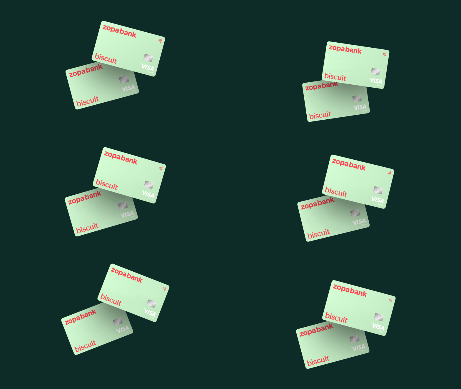
A card with character.
The Biscuit card design extends the brand’s playful, tactile world into customers’ wallets, giving each benefit a distinct character while keeping the system unmistakably Zopa.
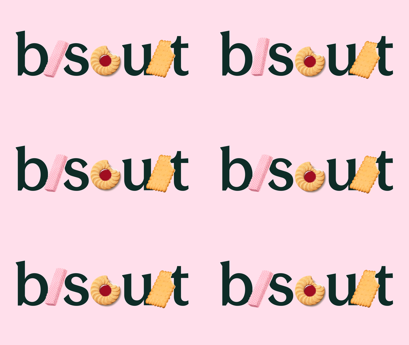
Biscuit, made tangible
Biscuit forms become part of the wordmark, turning the name into a playful expression of the product itself. The device brings together typography, texture and product storytelling in one distinctive piece of brand design.
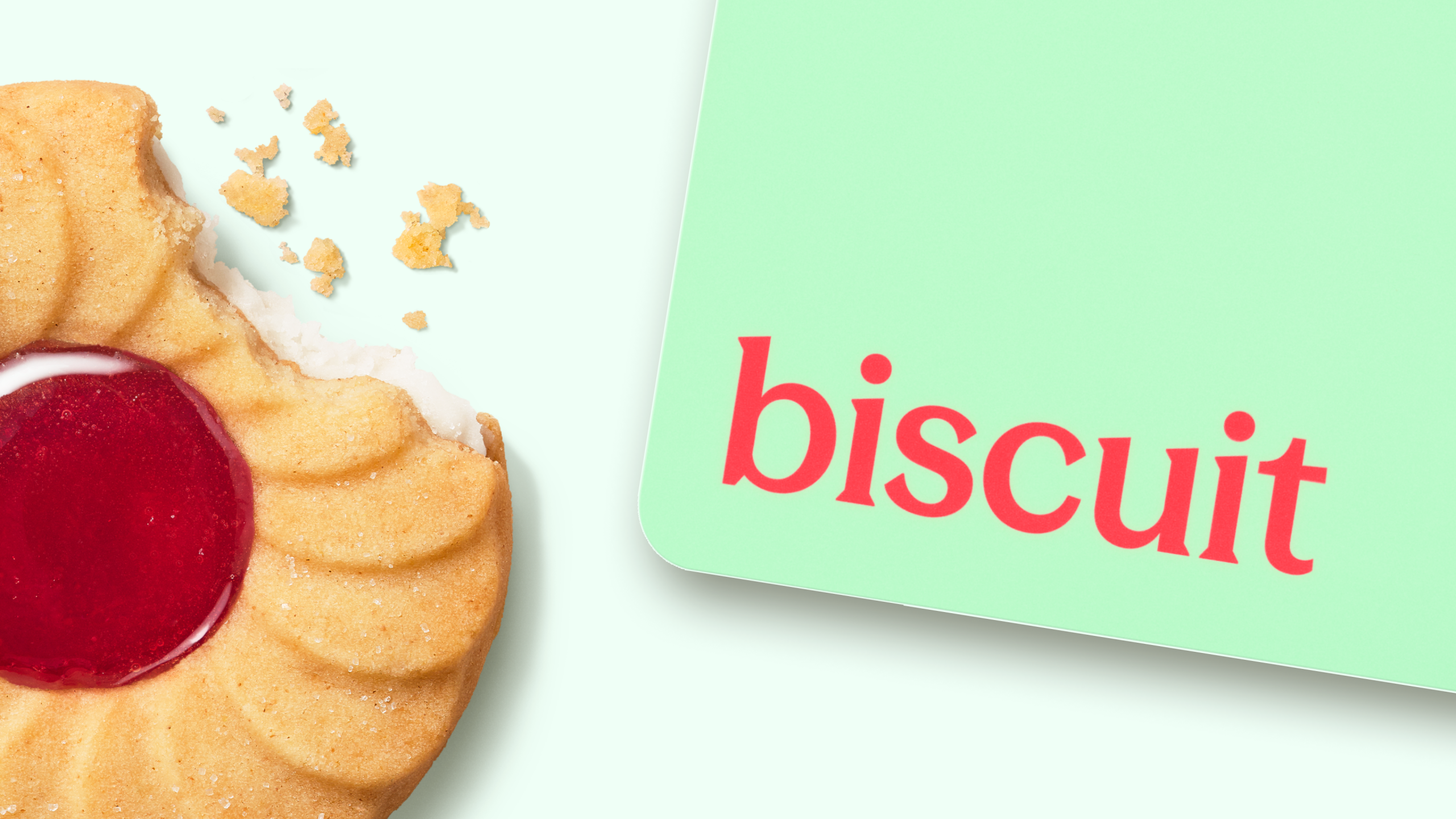
A name you already know
Biscuit takes its cue from a familiar British treat, warm, tactile and instantly recognisable. The identity turns that everyday familiarity into something distinctive, giving Zopa Bank’s current account a name and visual world with real character.

A palette with purpose
The Biscuit colour palette balances Zopa’s recognisable mint and dark green with warm crumb tones, soft pinks and the familiar jam accent. Together, they create a flexible system for communicating choice, change and everyday value.
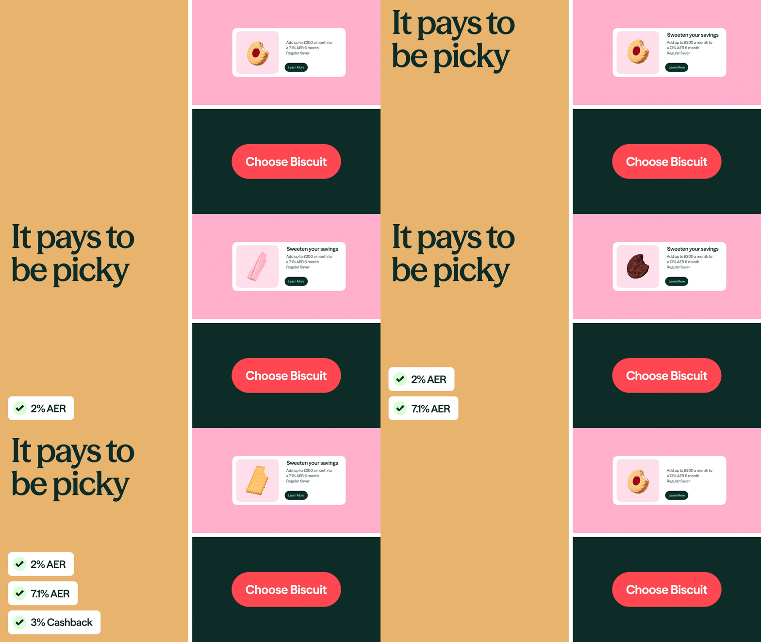
Built digital-first, designed to flex everywhere.
Biscuit was created as a responsive digital system, using motion, modular assets and in-app moments to make the account’s benefits feel immediate across every customer touchpoint.
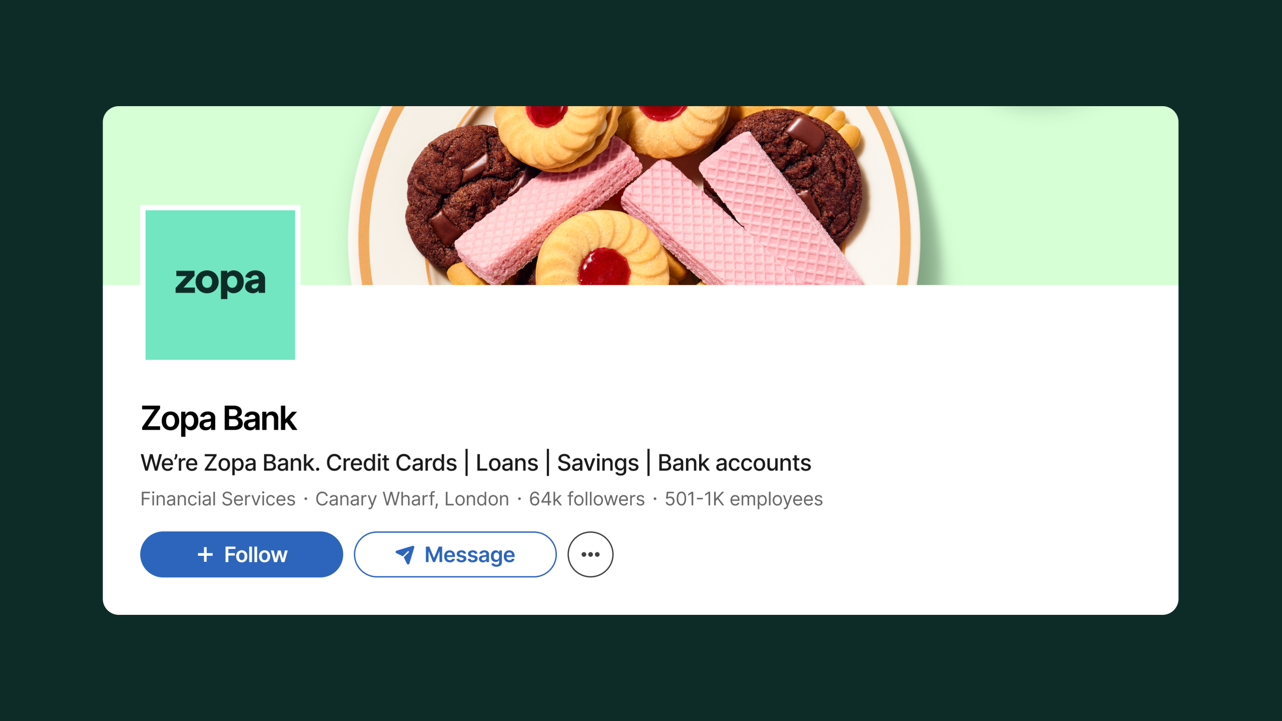
Built for every touchpoint
The refreshed Biscuit visual identity extends across Zopa Bank’s digital presence, from LinkedIn and social to product, CRM and campaign communications. The system keeps the current account recognisable wherever customers meet it.
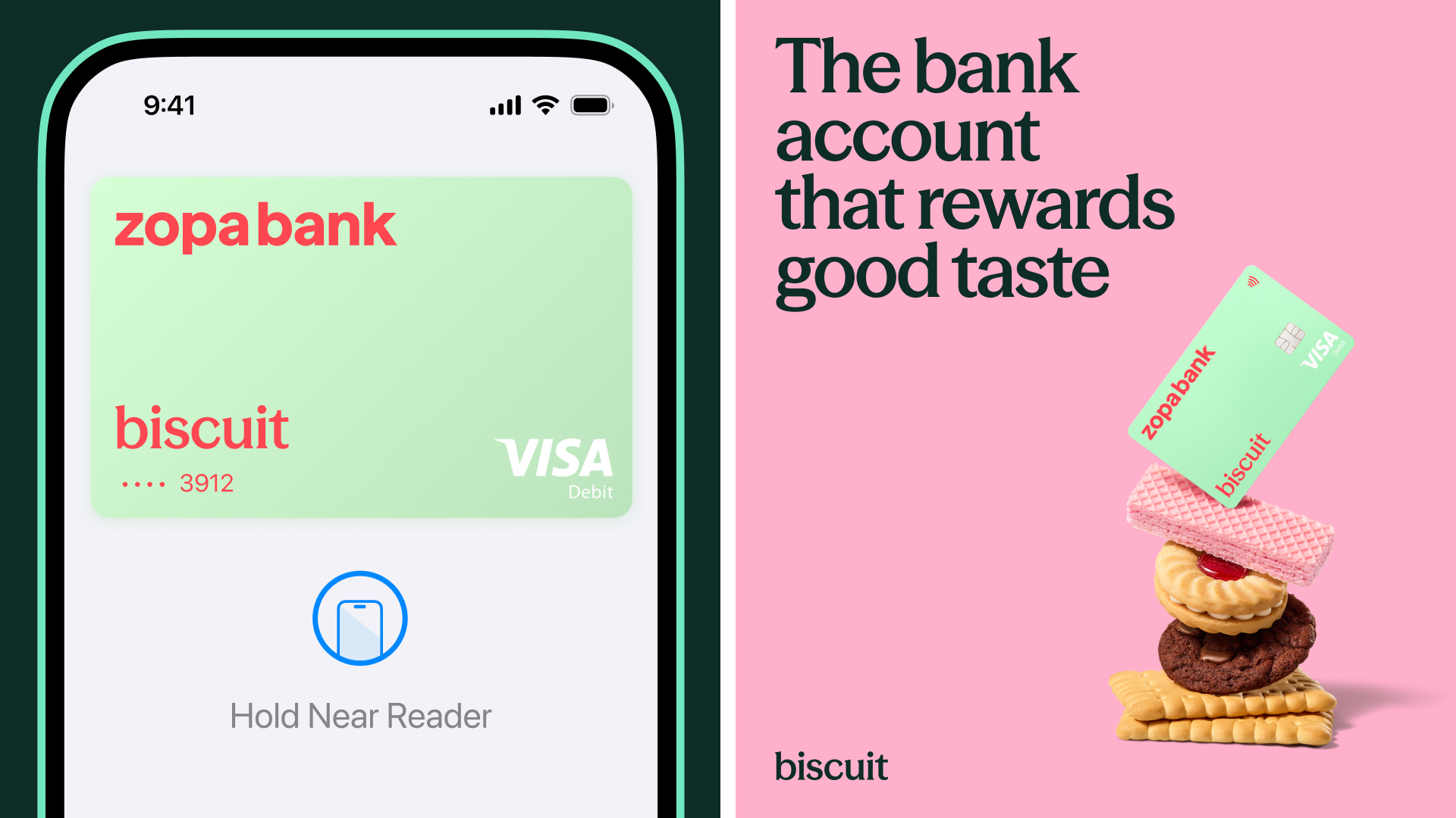
A brand with good taste
A warm, tactile identity for Zopa Bank’s current account, balancing playful biscuit forms with a clear, distinctive visual system.
Role
Head of Brand
Responsibilities
→ Creative Direction
→ Brand Strategy
→ Team Leadership
→ Design Direction
Credits
Zopa Bank
DEPT
Frankie Turner
Featured work
A selection of recent projects.

GSK
Ahead Together

JAJA Tequila
Made For Magic Hour
Hims
Telehealth for a healthier you
Let's Chat.
Opportunities start with a hello. Whether you’ve got a brief, a thought, or a good story, I’d love to hear it.
© 2026 Matthew Haysom.