Tomorrow
Better Sleep
Introduction
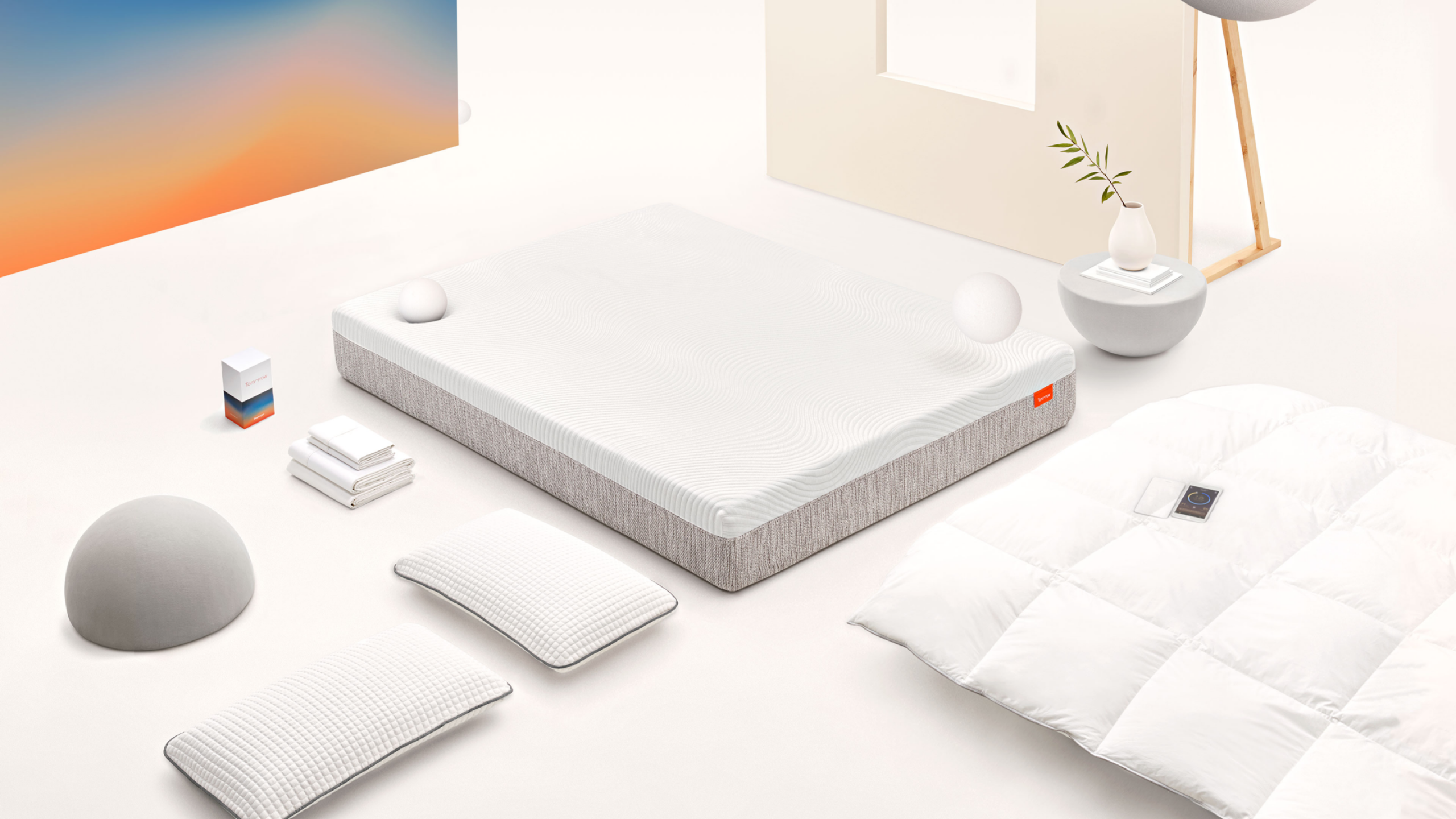
Tomorrow Sleep was a bold new sleep brand launched by Serta Simmons to challenge the traditional mattress market. Positioned at the intersection of science and lifestyle, the brand combined cutting-edge sleep technology with premium hybrid mattresses—offering a fully integrated sleep system designed for modern living.
Overview
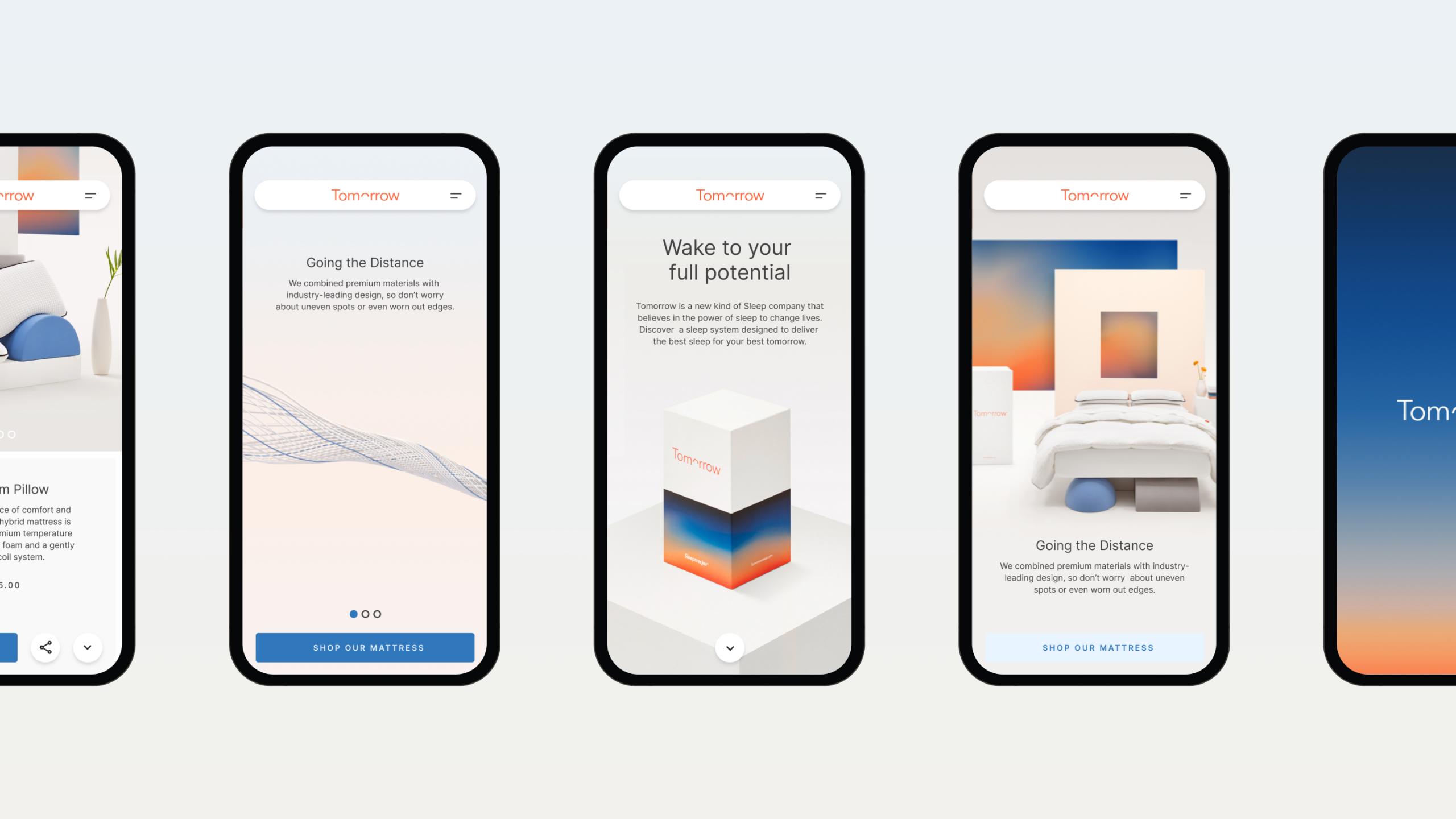
At Gin Lane, I was part of the design team that helped launch Tomorrow Sleep. I worked across website design, UX/UI, and art direction. From defining the visual language to crafting a seamless digital experience, I helped shape Tomorrow Sleep into a sleek, human-first brand that stood apart in a crowded DTC landscape. The work spanned concept development, interface design, tone of voice, and product storytelling—building a cohesive brand experience that merged tech, wellness, and comfort.

The Tomorrow Brand mark
Adusk-to-dawn colour arc, where the brand identity is built from the very thing it's designed to improve.
Hero the product
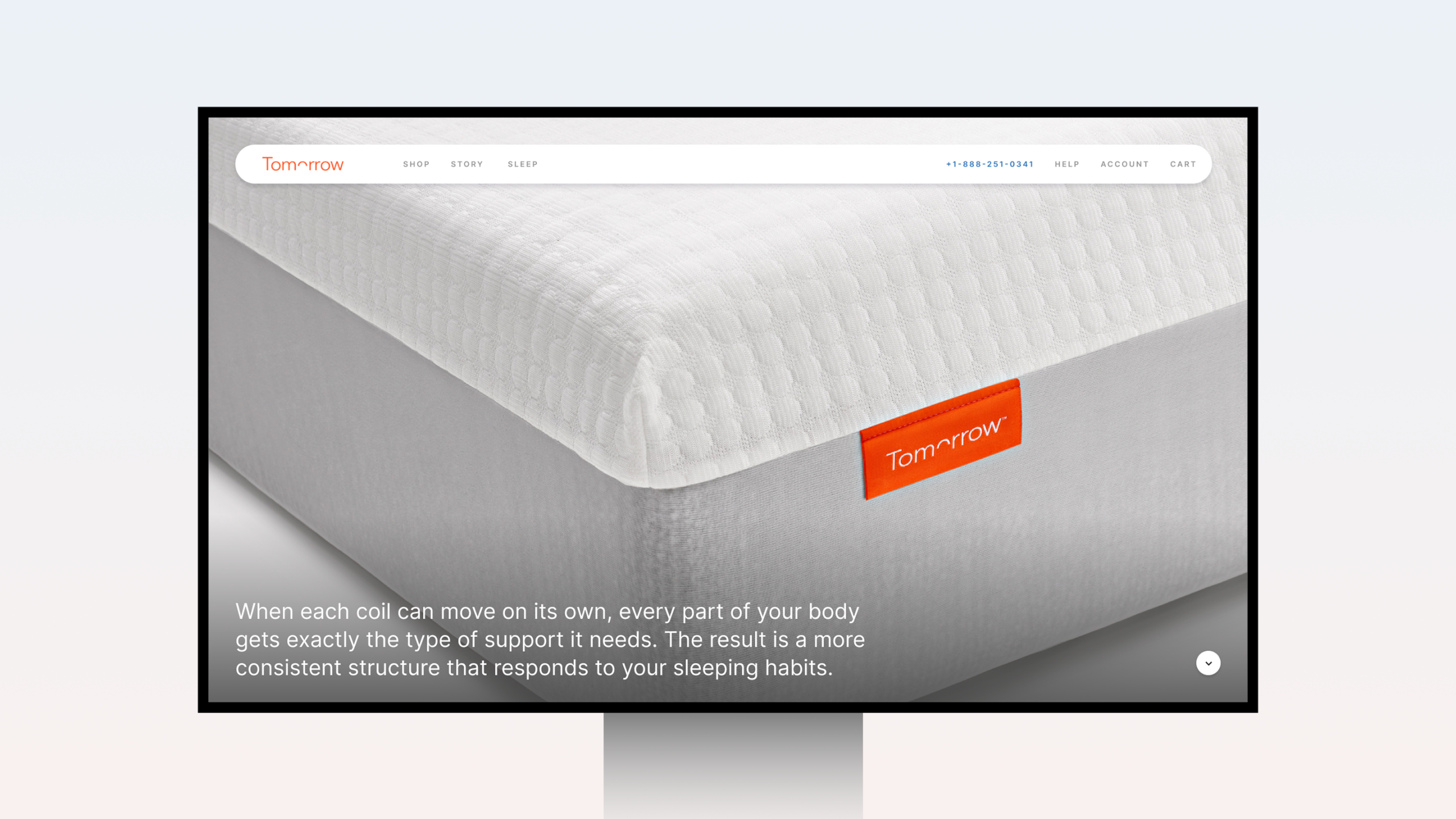
A desktop ecommerce hero that fills the frame with texture and detail, the kind of product storytelling that closes the gap between consideration and conversion.
The gradient, distilled to an icon
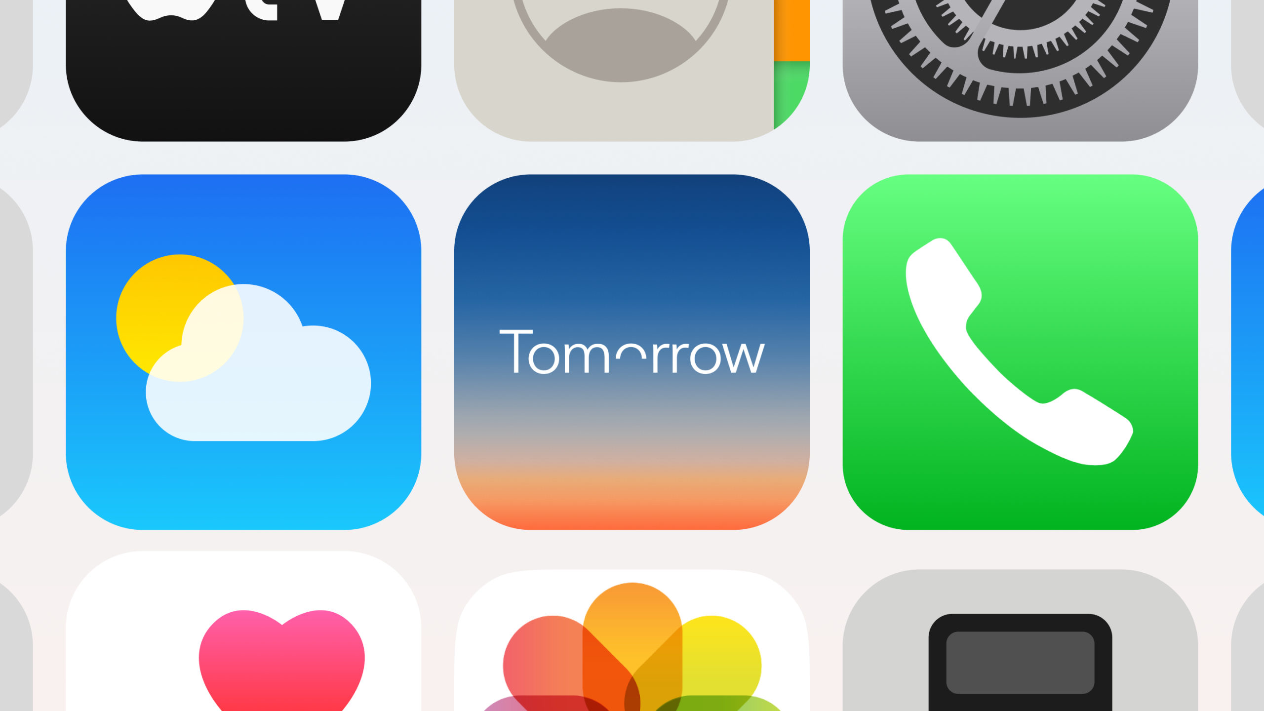
The Tomorrow Sleep app icon holds its gradient identity at the smallest scale, sitting comfortably between Weather and Phone.
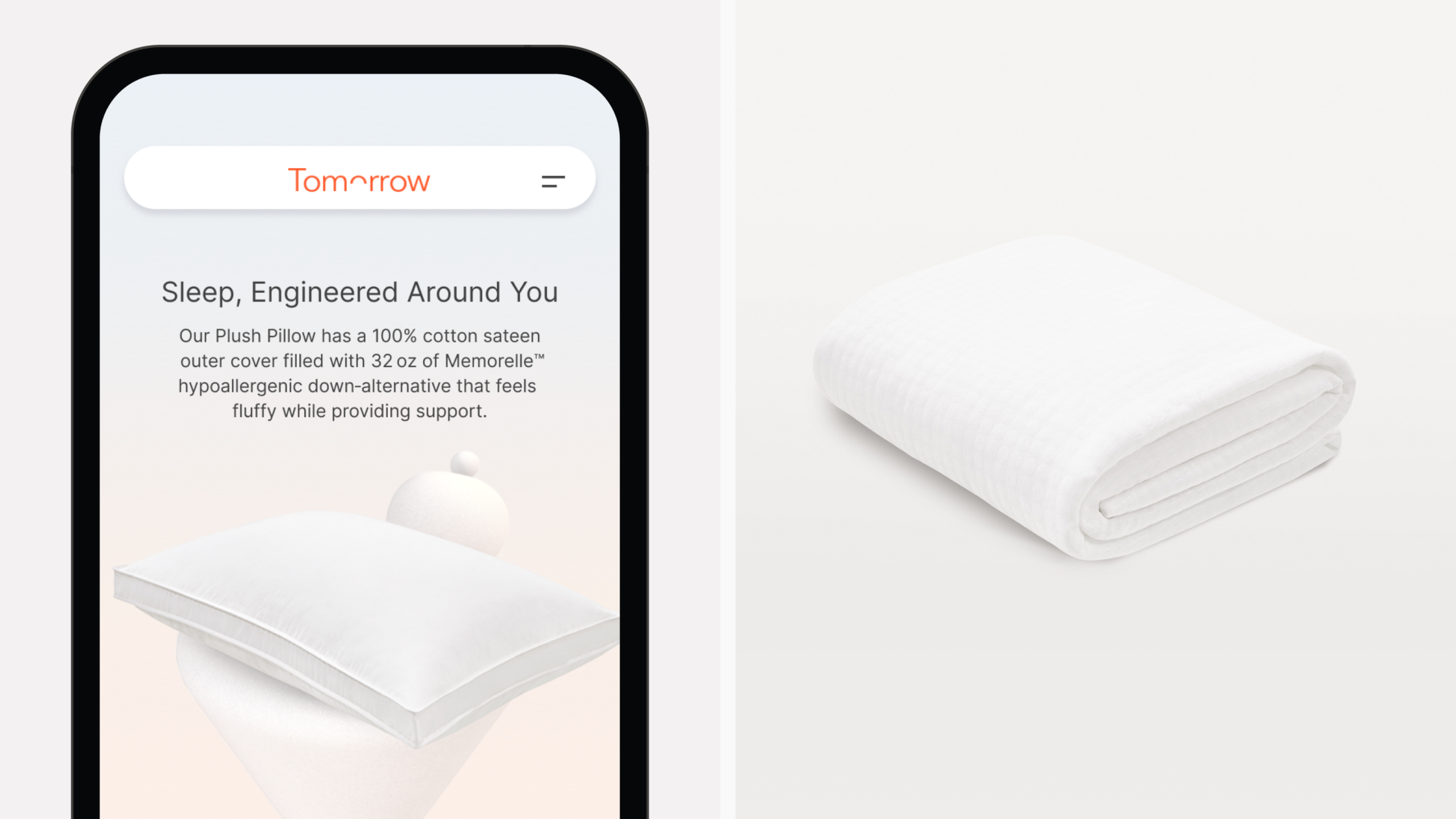
Soft type. Softer product
Mobile-first product design where typographic hierarchy and delicate pillow photography conspire to make the act of buying feel effortless.
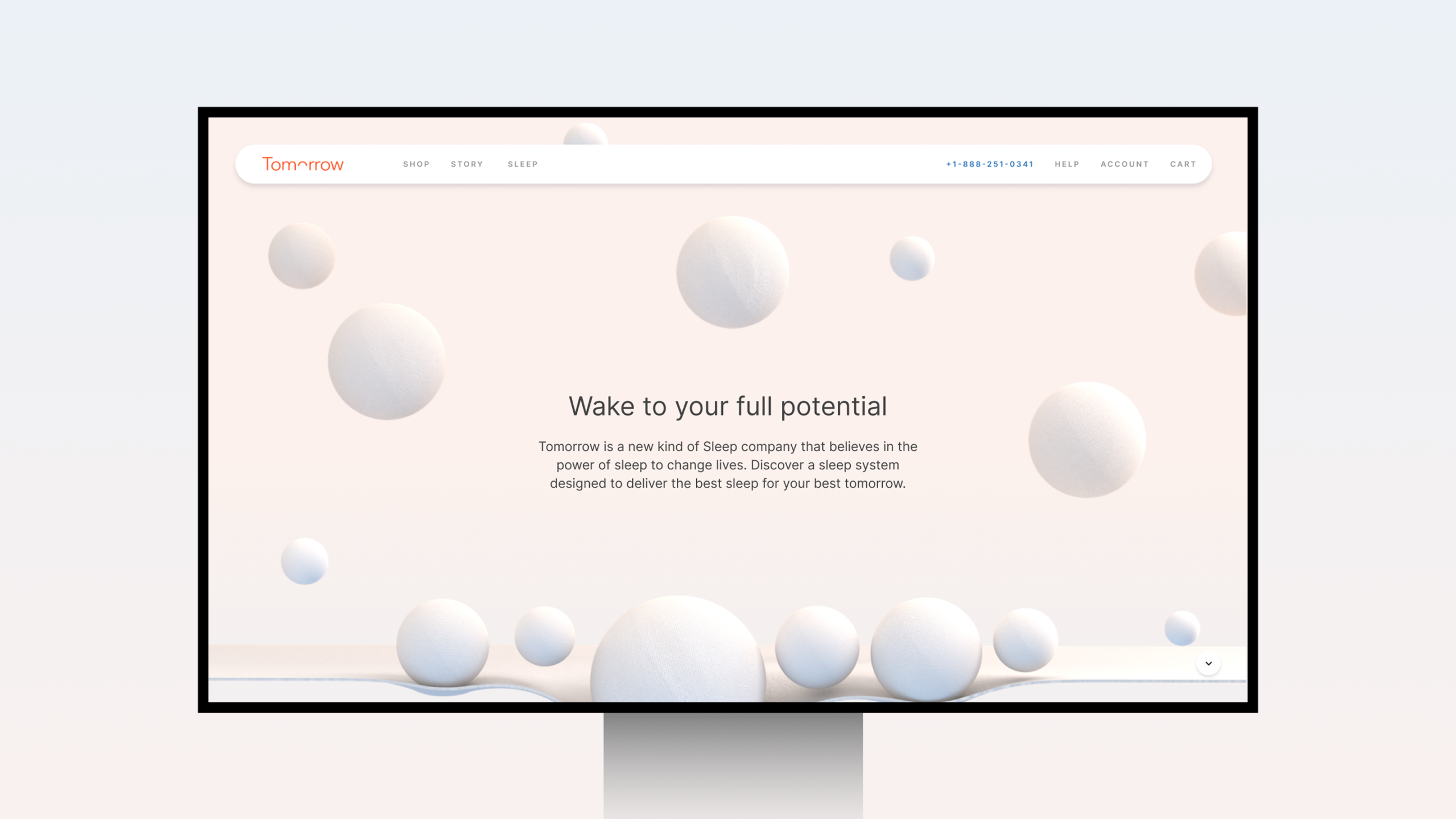
3D as brand language
A homepage hero that uses soft-body 3D forms and a blush gradient ground to create atmosphere before a single product is shown, immersive, considered, completely ownable.
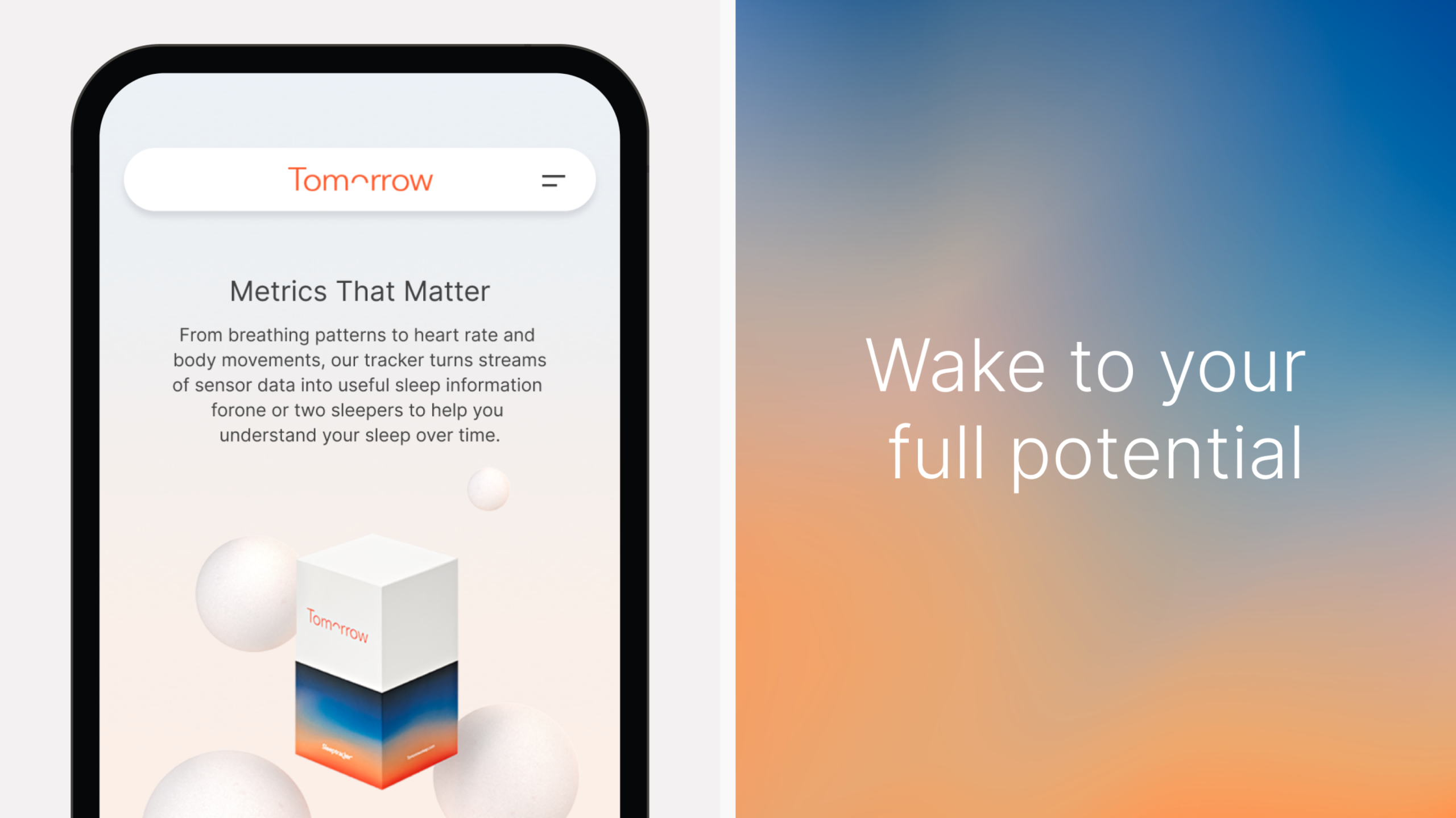
Science, wrapped in softness
Mobile UI that refuses to let data feel clinical, breathing patterns and heart rate rendered in the same warm palette as the brand world they live inside.
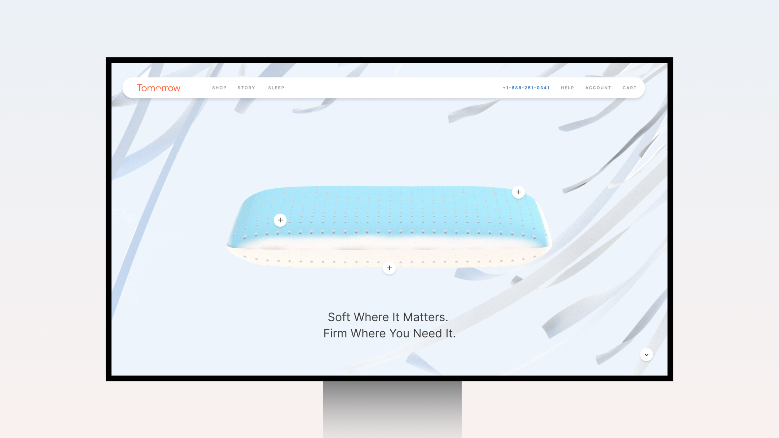
Interactive pillow PDP
A cross-section product page that turns technical specification into visual storytelling, interactive hotspots revealing the craft beneath the cover.
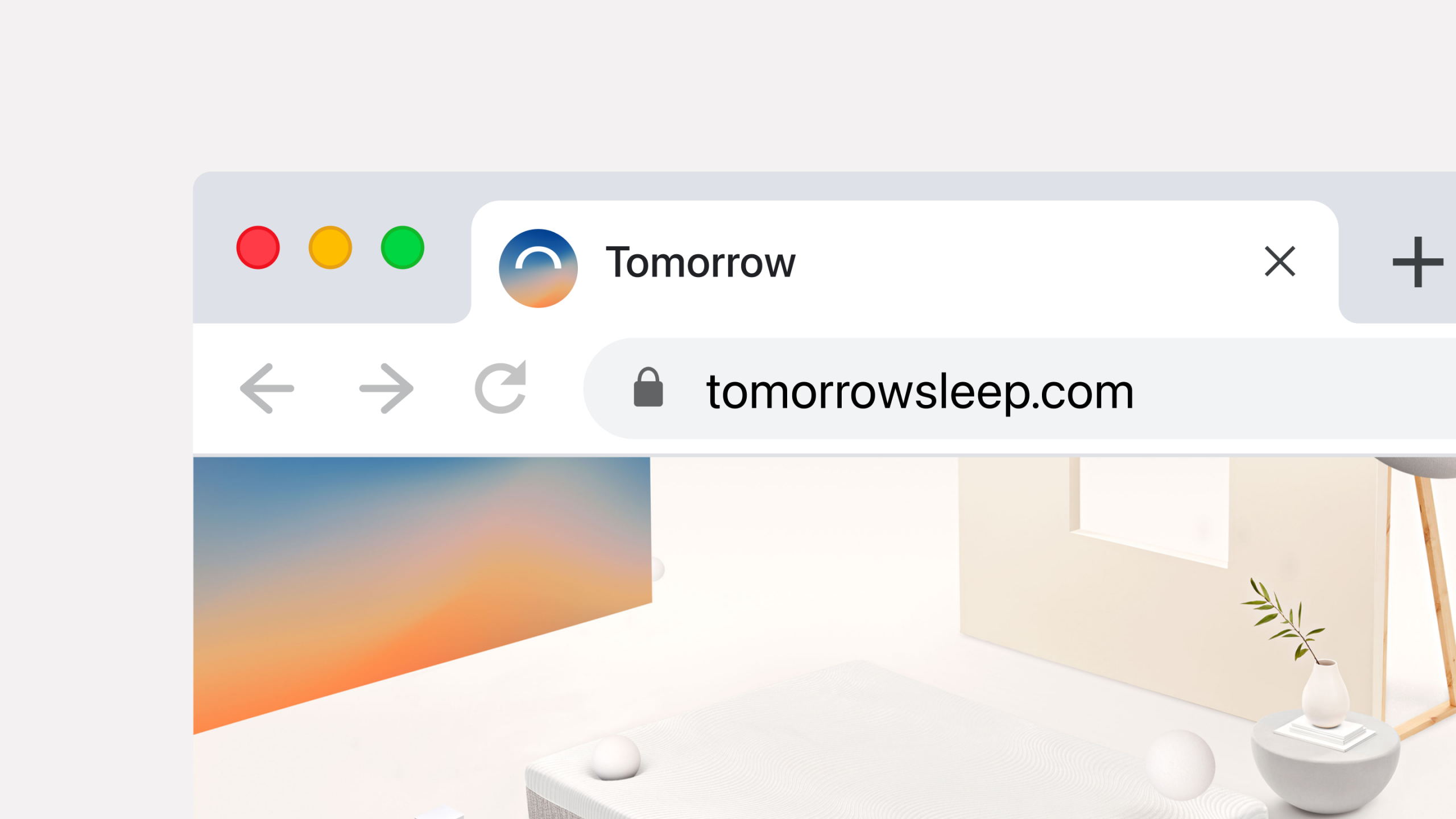
Favicon Down to the pixel
The gradient holds at 16 by 16, a small but telling sign of a brand system designed with end-to-end rigour.
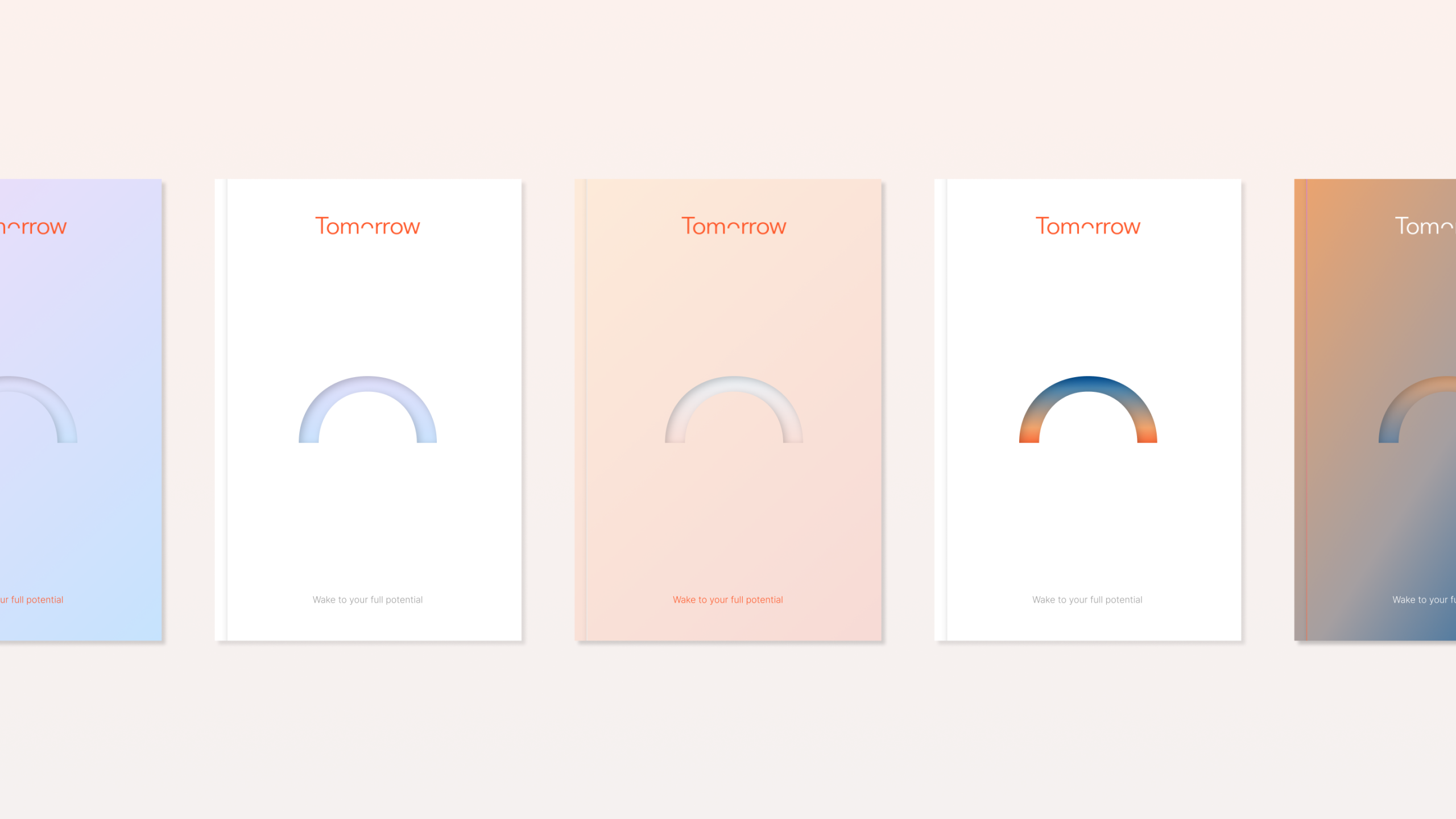
The arc, in every light
Physical brand collateral that proves the identity system travels, the arc mark recoloured across five cover treatments, each one distinct, all unmistakably Tomorrow.
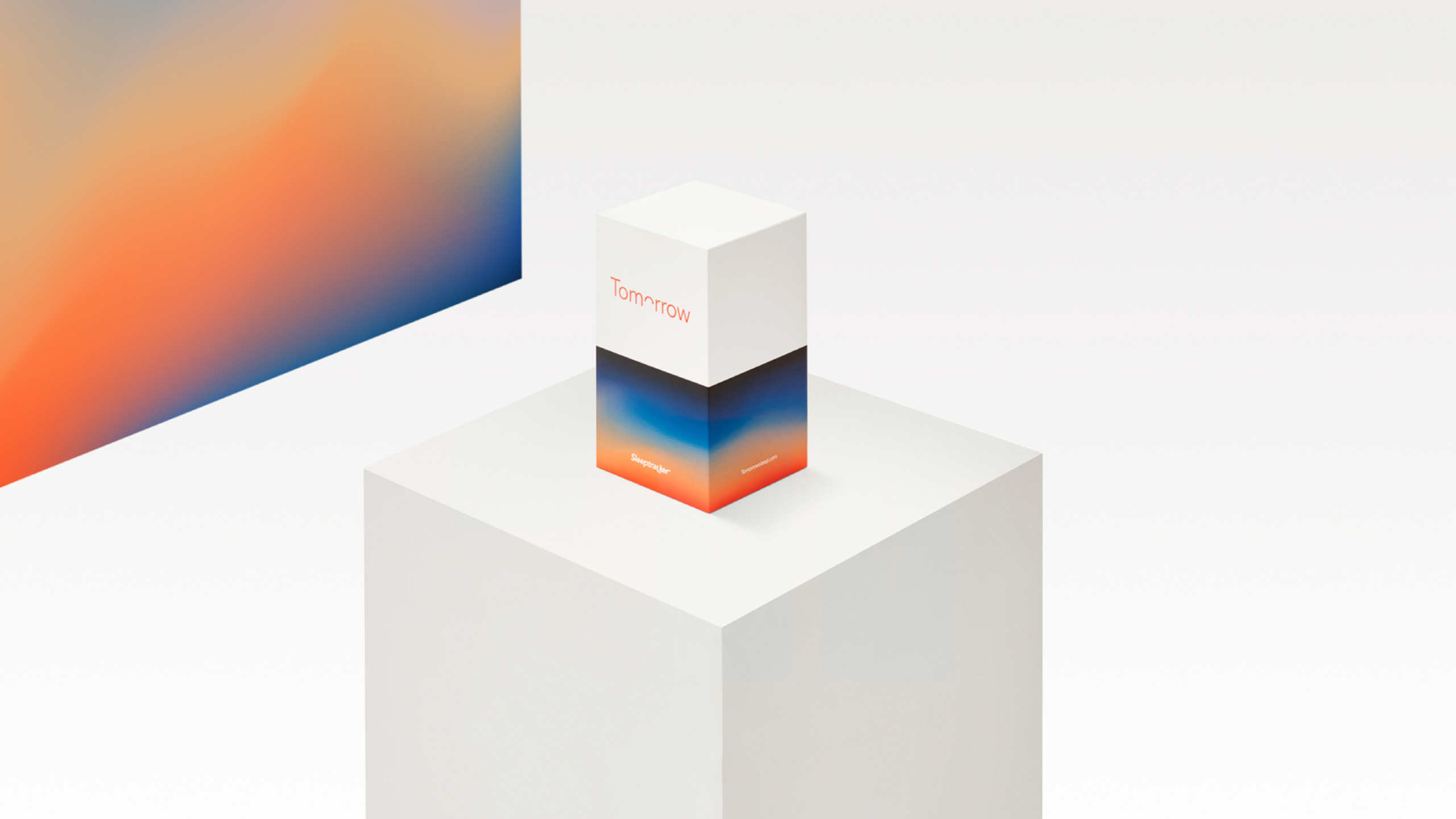
A horizon in your hands
Elegant structural packaging with the brand's signature dusk-to-dawn gradient wrapping the base, the kind of unboxing moment that earns its own Instagram post.
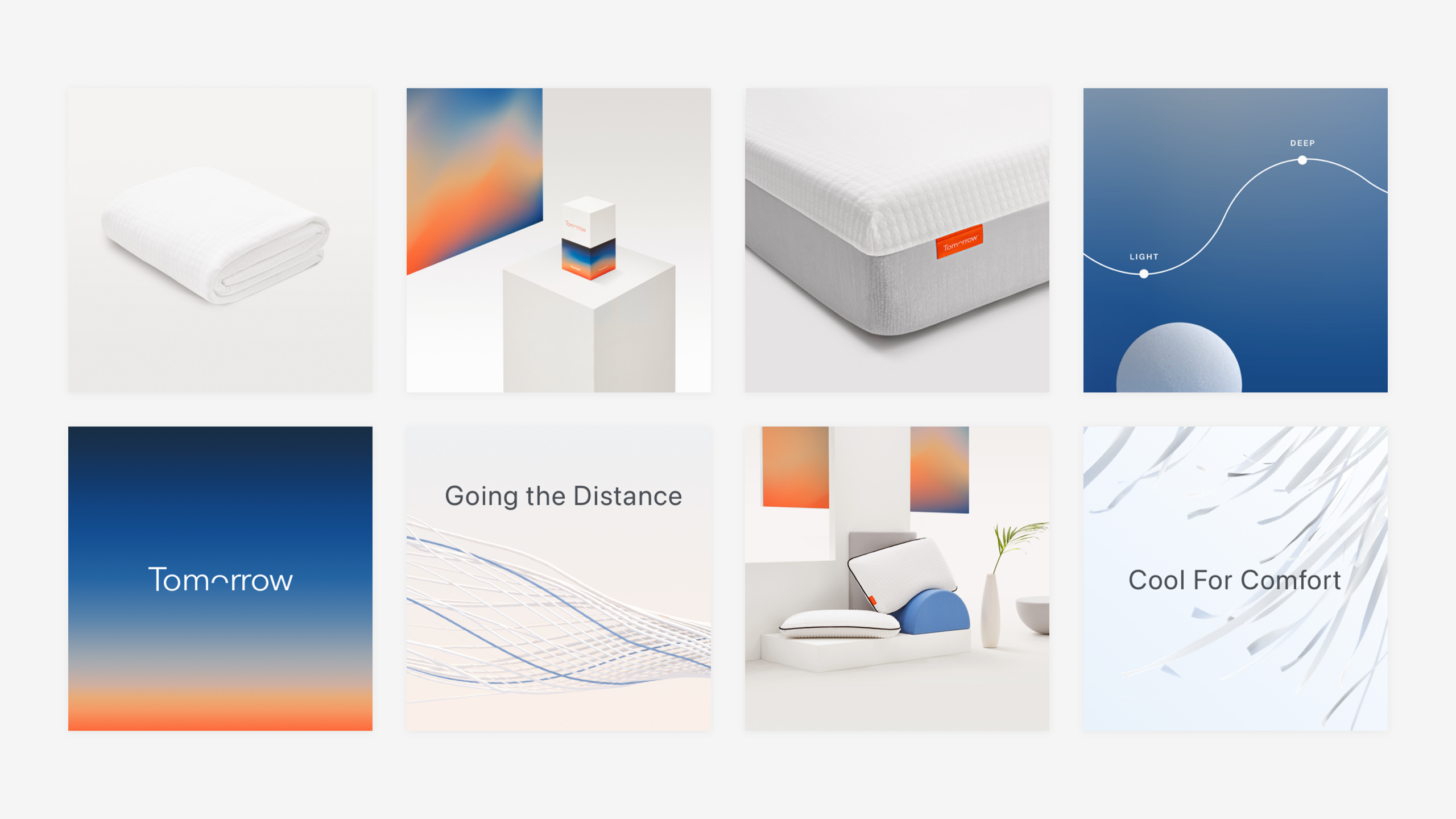
One world. Every touchpoint
A cohesive content system where gradient, geometry and editorial restraint hold eight different assets together without a single jarring note.
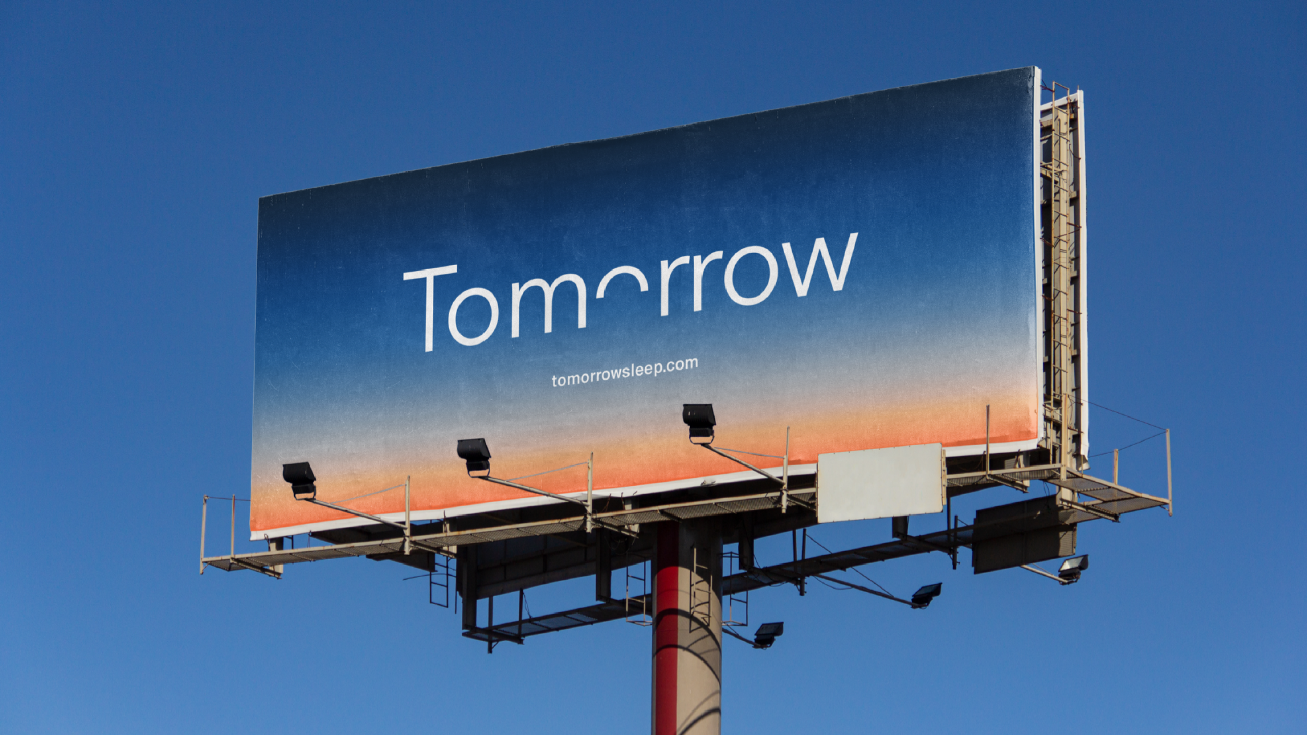
Billboard Brand meets horizon
Out-of-home done right,the wordmark set loose on a gradient sky, confident enough to let the atmosphere do the talking.
Role
Senior Brand & Experience Designer
Responsibilities
→ User Experience Design
→ Interactive Design
→ OOH Campaigns
→ Marketing Materials
→ Creative Consultation
Credits
Gin Lane
Featured work
A selection of recent projects.
GSK
Ahead Together
JAJA Tequila
Made For Magic Hour
Hims
Telehealth for a healthier you
Let's Chat.
Opportunities start with a hello. Whether you’ve got a brief, a thought, or a good story, I’d love to hear it.
© 2026 Matthew Haysom.